HTML5 Documentation
HTML5 - v1.4.x
Current Version
Released Jan 2026
v1.4.29 is the current stable release. You can get the JavaScript file here:
https://www.chartworks.io/content/chartworks/dist/1.4.29/js/chartworks.min.jsWhat's New
Features and Fixes
- Updated API URL locations
See the Change Log for previous versions.
Quick Start
Authentication
Before jumping into the Quick Start guide make sure you understand Authentication. In the below examples we will be using demo-token as our demo authentication token. This token is a required input into the Chart Config. Details on how to generate a real authentication token can be found in the Authentication section. Our demo-token is only entitled for delayed data for the following securities:
- Apple Inc (symbol: AAPL) trading on the NASDAQ
- Microsoft (symbol: MSFT) trading on the NASDAQ
Requests to chart any other securities will fail.
Minimum Example
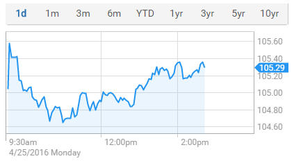
The HTML5 charts were built for easy integration. In the simplest form all it takes is the below HTML and Javascript to get a chart up and running on your page:
<!DOCTYPE html>
<html>
<head>
    <style>
        .chart {
            height: 440px;
        }
    </style>
</head>
<body>
    <!-- Target where HTML5 chart will load -->
    <div class="chart" id="chartTarget"></div>

    <!-- Chartworks JS -->
    <script src="https://www.chartworks.io/content/chartworks/dist/1.4.11/js/chartworks.min.js"></script>

    <!-- Chartworks Config -->
    <script>
        new ChartworksBuilder({
            "token": "demo-token",
            "target": "#chartTarget",
            "symbol": "AAPL",
            "exchange": "NSQ"
        });

    </script>

    <noscript>Please enable Javascript</noscript>

</body>
</html>
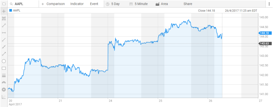
The result:
Full Example
This example uses most of the config parameters along with some of the Events and Methods. It represents what the setup might look like in a real-world implementation.
<!DOCTYPE html>
<html>
<head>
<style>
/* make chart fluid */
html, body {
height: 100%;
margin: 0;
overflow: hidden;
background-color: #000;
}
.chart {
height: 100%;
}
a {
color: #337ab7;
text-decoration: none;
}
</style>
</head>
<body>
<!-- Target where HTML5 chart will load -->
<div class="chart" id="chartTarget"></div>
<!-- Chartworks JS -->
<script src="https://www.chartworks.io/content/chartworks/dist/1.4.11/js/chartworks.min.js"></script>
<!-- Chartworks Config -->
<script>
new ChartworksBuilder({
"token": "demo-token",
"target": "#chartTarget",
"symbol": "AAPL",
"exchange": "NSQ",
"timeframe": "1y",
"realTime": false,
"typeAheadAPI": "https://api.wallst.com/apiman-gateway/MOD/chartworks-xref/1.0/xref/predictive?search=%s",
"compareMenuOptions": [{
"symbol": "MSFT",
"exchange": "NYQ",
"displayName": "Microsoft"
}],
"cultureCode": "en-US",
"style.indicator.price.lineColor": "orange",
"style.indicator.price.fillColor": "rgba(95, 179, 241, 0.1)",
"style.indicator.price.lineWidth": "3",
"panel.lower.indicator": "Volume",
"feature.symbolSearch": true,
"feature.comparison": true,
"feature.timeframe": true,
"feature.indicators": true,
"feature.intraday": true,
"feature.events": true,
"feature.markerType": true,
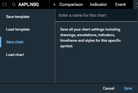
"feature.saveLoad": true,
"feature.saveLoadDefaultTemplate": true,
"feature.tools": true,
"theme": "dark",
"onShare": function(args) {
var sharePenURL = "https://codepen.io/chartworks/pen/ZpgQEb?chartID=" + args.chartID;
// show dialog with link to our chart
this.showDialog("<a href=" + sharePenURL + " target=\"_blank\">View Your Shared Chart in CodePen</a>");
},
"onPrimarySymbolChange": function(args) {
console.log(args.symbol, args.exchangeId);
// display a nice message when trying to get unentitled data
if (args.symbol != "AAPL" && args.symbol != "MSFT") {
this.showDialog("Alert", "This demo is only entitled to symbols AAPL and MSFT on the NASDAQ. All other symbols will fail.");
}
},
"onAPIError": function(apiError) {
// handle 401 (unauthorized)
if (apiError.status === 401) {
// show dialog that we are getting a new token
this.showDialog("Token expired", "Loading new token...");
// use getInvalidTokenCount to ensure we don't get stuck in an
// endless loop if we keep creating bad tokens
if (this.getInvalidTokenCount() < 5) {
var objChart = this;
getNewToken(function(newToken) {
// set token
objChart.setConfigParam('token', newToken);
// load data
objChart.loadData();
});
} else { // fail after 5 unsuccessful tries
this.showDialog("Warning", "Max number of auth attempts reached. Your token generation is no good!");
}
} else { // print other errors in the console
console.log(apiError.status, apiError.statusMsg);
}
}
});
// Your code should generate a new token.
// This is just an example
function getNewToken(onComplete) {
// timeout to simulate a slow request
setTimeout(function() {
var token = "demo-token";
onComplete(token);
}, 1000);
}
</script>
<noscript>Please enable Javascript</noscript>
</body>
</html>
The result:
Web Component Example
Here is an example of loading Chartworks as a Web Component, which can ensure the JS and CSS of Chartworks is properly sandboxed from the parent page. There are two files to define: first the HTML page containing the component, and second the component JS itself. In the Chartworks inputs you will also need to define both shadowTarget and target, as shown below.
This feature is available in Chartworks version 1.4.22 and above.HTML file (index.html):
<!DOCTYPE html>
    <head>
      <meta charset="utf-8">
      <meta content="viewport width=device-width, initial-scale=1.0" />
      <title>Chartworks Web Component Demo</title>
      <link rel="stylesheet" type="text/css" href="style.css">
      <link rel="stylesheet" type="text/css" href="https://fonts.googleapis.com/css?family=Roboto">
    </head>
    <body>
      <div class="container clearfix">
        <h1>Chartworks Web Component Demo</h1>
        <div class="left sample">Left content</div>
        <div class="web-component">
          <!-- Here is the Web Component -->
          <chartworks-element symbol="AAPL" exchange="NSQ" token="demo-token"></chartworks-element>
        </div>
        <div class="right sample">Right content</div>
      </div>
      <div class="bottom sample">Bottom content</div>

      <script src="https://www.chartworks.io/content/chartworks/dist/1.4.22/js/chartworks.min.js"></script>
      <script src="ChartworksElement.js"></script>
    </body>
    </html>
Web Component (ChartworksElement.js):
  // create the HTML template that will contain the Chartworks chart
  const template = document.createElement('template');
  template.innerHTML = `
    <style>
    #chart-dom-element {
    width: 600px;
    height: 400px;
    }
    </style>
    <div id="chart-dom-element"></div>
  `;

  // create a custom HTMLElement
  class ChartworksElement extends HTMLElement {
    constructor () {
      super();
      this.attachShadow({ mode: 'open' });
    }

    // once the element exists, mount Chartworks
    connectedCallback () {
      // add template
      this.shadowRoot.appendChild(template.content.cloneNode(true));

      // initialize chartworks
      this.chartworks = new ChartworksBuilder({
        "token": this.getAttribute("token"),
        "symbol": this.getAttribute("symbol"),
        "exchange": this.getAttribute("exchange"),
        "shadowTarget": "chartworks-element",
        "target": "#chartTarget",
        "feature.timeframe": true,
        "feature.indicators": true,
        "template.size": "large",
        "feature.panZoom": true,
        "panel.lower.indicator": "volume"
      });
    }

    // clean up if/when element is removed
    disconnectedCallback () {
      this.chartworks.destroy();
    }
  }

  // define our new DOM element as "chartworks-element"
  window.customElements.define('chartworks-element', ChartworksElement);
Live example:
Chart Breakpoints
The HTML5 chart was built with responsive displays in mind. It has a single break-point at a width of 780px. Charts that are less than 780px wide when rendered will only show a time-frame navigation in the top menu. Charts that are 780px or wider will display the drawing tools as well as the full set of options in the top menu. If you render a chart that is 780px or wider you can suppress menu items from appearing in the config if you wish. However, if you wish to override the breakpoint you can do so with template.size. The template.size gives you the ability to show the 'large' chart in areas less than 779px wide and vice versa show 'small' chart in areas greater than 779px.
Small Template: 779px wide or less
The small chart only shows the timeframe selector by default. You can optionally show a comparison menu and rollover information via feature.small.comparison and feature.small.dataLegend. Customize your timeframes as well via feature.small.timeframes.
Large Template: 780px wide or more
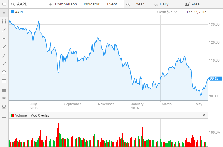
Chart Height and Width
There are a few different ways to setup the height and width of the HTML5 charts. Implementation situations vary so we tried to make the charts flexible. Height and width can be set in two locations:
- In the CSS
- In the chart config via the
panel.lower.size.heightandpanel.upper.size.heightparams
Your implementation will dictate which you use. We'll walk through the main use cases below.
Fluid Setup
This setup allows the chart to use the entire height and width of the target element. All of the height/width logic is handled in the CSS and the panel.lower.size.height and panel.upper.size.height parameters are not included in the chart config. When additional lower indicators are added to the chart all other panels get slightly smaller to fit the new panel. This setup works especially well when you give the chart an entire page.
Fixed Overall Height
If you are looking for your overall chart to stay the same height regardless of the number of lower indicators added you can set the height in the CSS and the panel.lower.size.height and panel.upper.size.height parameters are not included in the chart config. When additional lower indicators are added to the chart all other panels get slightly smaller to fit the new panel. Note that this height includes the menus as well.
Fixed Panel Height
In this case we are defining the height of the top panel as well as the height of each lower indicator panel using the panel.lower.size.height and panel.upper.size.height parameters in the chart config. CSS is not used. When additional lower indicators are added to the chart the overall chart hight will 'grow' by the panel.lower.size.height thus the chart will continue to get taller with each new lower indicator added.
Width
Width is straight-forward, always handled in CSS.
Type Ahead Searches
End users expect their symbol searches to include type ahead functionality so we've built this into our HTML5 charts. If you are using a Commonly Known Symbol Set or a Custom Symbol Set then we will supply the API URL that you will put in the Chart Config typeAheadAPI input; basically we handle everything for you in this case.
If you are instead using Exchange Symbol + Exchange Code for your symbol set you'll need to setup a simple API that powers the type ahead searches in the UI.
Type Ahead API URL Format
The API is fairly simple, in the Chart Config the typeAheadAPI input takes an API URL (we recommend using HTTPS). In the URL insert %s for where the search term should be added. For example your URL might look like this:
https://yourTypeAheadApi.com?searchTerm=%s
In this case the %s will be replaced with whatever the user types into the search field. For example if the user types in aap the following URL will get called:
https://yourTypeAheadApi.com?searchTerm=aap
You can alternatively add the search parameter in the path:
https://yourTypeAheadApi.com/searchTerm/%s
Using our same example from above the resulting API call would be:
https://yourTypeAheadApi.com/searchTerm/aap
Type Ahead API Response Format
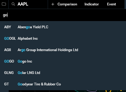
Your type ahead API should return a JSON array of results. The UI will display the results in the order they come back in the JSON array. The HTML5 UI does no additional filtering or searching on the results when they are handed back. The HTML5 UI will simply highlight the search term in the results. You can see this in the screenshot above where the user is searching for "go" and you can see each instance of "go" highlighted in the results.
The response array should be under the data.items object (see example) and should consist of the following fields:
symbol
string: required
The symbol of the security. See Symbology for more details.
exchange
string: optional/required
The exchange code for the symbol. This input is required if you are utilizing the Exchange Symbol + Exchange Code as your symbol set; otherwise it is optional. See Symbology for more details.
displayName
string: required
The name you would like displayed in the type ahead menu for this security.
displaySymbol
string: optional
By default the chart displays the symbol in the type ahead menu. If a value is passed for 'displaySymbol' this value will be displayed in the type ahead menu instead of symbol. In some cases a client may wish to override the symbol and instead display an alternative symbol in the menu. For example, if the client is using the RIC symbol set and therefore must pass in 'MSFT.O' in the symbol field to chart MSFT on the NASDAQ but would rather just display 'MSFT' in the menu they can pass "displaySymbol": "MSFT" in the JSON to achieve this.
displayExchange
string: optional
By default, starting with v1.3, no exchange is appended to the symbol in the type ahead menu. If you wish to also display an exchange code you can include 'displayExchange' in your JSON response for it to be displayed in the menu.
Example API Response 1
{"data":
    {"items":
        [{
            "symbol": "AAP",
            "exchange": "NYSE",
            "displayName": "Advance Auto Parts Inc"
        },{
            "symbol": "AAPL",
            "exchange": "NSQ",
            "displayName": "Apple Inc"
        }]
    }
}
Example API Response 2
{"data":
    {"items":
        [{
            "symbol": "AAP.N",
            "displayName": "Advance Auto Parts Inc",
            "displaySymbol": "AAP",
            "displayExchange": "NYSE"
        },{
            "symbol": "AAPL.O",
            "displayName": "Apple Inc",
            "displaySymbol": "AAPL",
            "displayExchange": "NASDAQ"
        }]
    }
}
End to End Example
The below is an example API response for a user that typed in goo into the search.
API Call:
https://yourTypeAheadApi.com?searchTerm=goo
API Response
{"data":
    {"items":
        [{
            "symbol": "GOOGL",
            "exchange": "NSQ",
            "displayName": "Alphabet Inc"
        },{
            "symbol": "GT",
            "exchange": "NSQ",
            "displayName": "Goodyear Tire & Rubber Co"
        },{
            "symbol": "DKS",
            "exchange": "NYSE",
            "displayName": "Dick's Sporting Goods Inc"
        }]
    }
}
UI Result
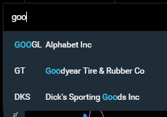
User Click/Select Option
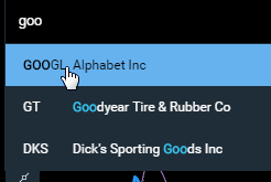
Upon click/select the chart pulls the symbol and exchange parameters (in this case "GOOGL" and "NSQ") and use these to either render a new chart or to add a comparison depending on the search context.
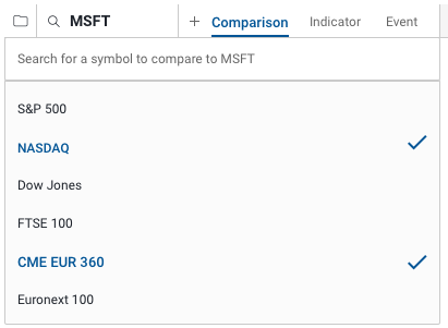
Compare Menu
The compare menu is composed of two sections: the symbol search and a predefined list of securities to check. The symbol search is powered by the Type Ahead API and the predefined list of securities is based on the 'compareMenuOptions' parameter in the Chart Config which takes a JSON array to populate the list. Also see compareSymbols.
JSON Inputs for compareMenuOptions
In the Chart Config the compareMenuOptions accepts a JSON array composed of the following parameters:
symbol
string: required
The symbol that is to be charted as a comparison. See Symbology for more details.
exchange
string: optional/required
The exchange code for the symbol that is to be charted as a comparison. This input is required if you are utilizing the Exchange Symbol + Exchange Code as your symbol set; otherwise it is optional. See Symbology for more details.
displayName
string: required
The name you would like displayed in the Compare menu for this item.
Example
The below is an example JSON array for the compareMenuOptions parameter in the Chart Config.
"compareMenuOptions": [{
    "symbol": "SPY",
    "exchange": "NYSE",
    "displayName": "SPDR S&P 500 ETF Trust"
}, {
    "symbol": "QQQ",
    "exchange": "NSQ",
    "displayName": "PowerShares QQQ Trust"
}]
If no JSON array is passed into the config then no default options will be displayed in the Compare menu.
Extended Hours
Extended hours on intraday charts is available for US exchanges (additional data entitlements may be required). Extended hours are shaded on the chart for both pre and post market hours.
There are a number of ways to enable extended hours on your chart. To enable extended hours by default you can use the extendedHours config param. Optionally, on large charts, you can enable the settings menu via feature.settings to be displayed in the top right which gives the user access to toggle on/off extended hours:
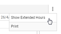
You can always use the setConfigParam method to toggle extended hours on/off in your own code as well.
chartworks.setConfigParam("extendedHours", true);
Currency Cross Rates
Currency cross rates represent a unique challenge as not all published symbol sets have symbols for all of the various currency cross rates. Often the major cross rates have symbols but the more obscure pairings generally do not. To solve this issue the chart config now accepts an optional crossRate parameter. Please note that additional data entitlements may be required to display currency cross rates.
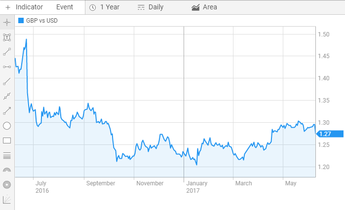
The crossRate parameter acts just like the symbol input except it takes the two currency codes separated by a pipe '|' that you wish to chart the cross rate of on the chart. For example if you wished to chart the US Dollar vs Great British Pound as simple config would look like this:
new ChartworksBuilder({
    "token": "your-token",
    "target": "#chartTarget",
    "crossRate": "GBP|USD"
});
The resulting chart would be:
The crossRate parameter can also be passed into the compareMenuOptions and compareSymbols config inputs. The below example would load with GBP vs USD compared to EUR vs USD and then have more currency comparison options listed in the 'Comparison' menu for the user to easily add to the chart.
new ChartworksBuilder({
    "token": "your-token",
    "target": "#chartTarget",
    "crossRate": "GBP|USD",
    "displaySymbol": "GBP vs USD",
    "compareSymbols":[{
        "displaySymbol": "EUR vs USD",
        "crossRate": "EUR|USD"
    }],
    "compareMenuOptions": [{
        "displayName": "US Dollar (USD) / Australian Dollar (AUD)",
        "displaySymbol": "USD vs AUD",
        "crossRate": "USD|AUD"
    },{
        "displayName": "US Dollar (USD) / Euro (EUR)",
        "displaySymbol": "USD vs EUR",
        "crossRate": "USD|EUR"
    },{
        "displayName": "US Dollar (USD) / Swiss Franc (CHF)",
        "displaySymbol": "USD vs CHF",
        "crossRate": "USD|CHF"
    }],
    "typeAheadAPI": "your-type-ahead-api"
});
Indicators
The following are the indicators available in Chartworks HTML5. Each is listed as Indicator Name – ID – Default parameters, for use when adding to a chart, removing from a chart, or setting custom parameters:
Upper Indicators
- Bollinger Bands –
bollinger–{"period":20,"standardDeviations":2} - Exponential Moving Average –
ema–{"period":20} - High/Low Price –
highlow– none - Ichimoku Cloud –
ichimokucloud–{"fastPeriod":9,"mediumPeriod":26,"slowPeriod":52,"displacementCloud":26} - Linear Regression –
linearregression– none - Moving Average Envelope –
mae–{"period":20,"highfactor":1.04,"lowfactor":0.96} - Previous Close –
previousclose– none - Price Channel –
pricechannel–{"period":20} - Parabolic Stop and Reversal –
psar–{"initialPosition":0,"accelerationIncrease":0.02,"accelerationMaximum":0.02} - Simple Moving Average –
sma–{"period":20} - Time Series Forecast –
tsf–{"period":20} - Volume by Price –
volumebyprice–{"numBars":12} - Weighted Moving Average –
wma–{"period":20}
Lower Indicators
- Accumulation / Distribution –
adl– none - Average True Range –
avgtruerange–{"period":14} - Awesome Oscillator –
awesomeoscillator–{"period1":5,"period2":34} - Bollinger Band Width –
bollingerbandwidth–{"period":20,"standardDeviations":2} - Bollinger Band %B –
percentb–{"period":20,"standardDeviations":2} - Chaikin's Volatility –
chaikins–{"EMAPeriod":10,"DifferencePeriod":10} - Dividend Yield –
dividendyield– none - Directional Moving Index (DMI) –
dmi–{"period":EMAPeriod":10,"DifferencePeriod":10} - Fast Stochastics –
faststochastics–{"kperiod":14,"smoothing":1,"dperiod":3} - Historical Dividend –
rollingdividend– none - Moving Average Convergence Divergence (MACD) –
macd–{"fastperiod":12,"slowperiod":26,"smoothing":9} - Mass Index –
massindex–{"period":25} - Momentum –
momentum–{"period":20} - Money Flow –
moneyflow– none - Money Flow Index –
moneyflowindex–{"period":14} - On Balance Volume –
onbalancevolume– none - Price Rate of Change –
proc–{"period":14} - Relative Strength Index (RSI) –
rsi–{"period":14} - Slow Stochastics –
slowstochastics–{"kperiod":14,"smoothing":3,"dperiod":3} - Ultimate Oscillator –
ultimateoscillator–{"period":period1":7,"period2":14,"period3":28,"factor1":4,"factor2":2,"factor3":1} - Volume –
volume– none - Volume Rate of Change (VROC) –
vroc–{"period":10} - Williams %R –
williamspctr–{"period":14}
Chart Config
The chart config supplies all of the inputs to render the chart. Check out the full example to see what this looks like. In the example you'll see all the config parameters listed below pass into ChartworksBuilder:
window.chartworks = new ChartworksBuilder({
    "token": "demo-token",
    "target": "#chartTarget",
    ...
    ..
    .
});
apiAuthMode
string: optional
Description: Specifies the authentication mode for API requests. This parameter controls how authentication credentials are passed to the Chartworks API (Query String or HTTP Authentication header).
Default: "querystring"
Example
"apiAuthMode": "header"
cdnEnabled
string: optional
Description: Enable/disable the CDN prefix for loading Chartworks dependencies. This can be applied separately to QA and Production environments.
Default: true
Example
"cdnEnabled.qa": true"cdnEnabled.prod": truechartID
string: optional
Description: The unique ID generated during an onShare event can be passed into the chart config to load that shared chart. Also see feature.share.
Default: NULL
Example
"chartID": "1d355737"
compareMenuOptions
JSON array: optional
Description: JSON array for the compare menu. See the Compare Menu section for more details. Also see compareSymbols.
Default: NULL
Example
"compareMenuOptions": [{
    "symbol": ".SPX",
    "exchange": "NYS",
    "displayName": "S&P 500 Index"
}, {
    "symbol": "COMP",
    "exchange": "NSQ",
    "displayName": "NASDAQ Index"
}, {
    "symbol": "UKX",
    "exchange": "FSI",
    "displayName": "FTSE 100 Index"
}]
compareSymbols
JSON array: optional
Description: When passed a JSON array the symbols in the JSON array are loaded as comparisons when the chart renders. If you are looking to load a chart with a comparison already showing the compareSymbols input allows you to do so without the user having to manually add the comparisons. Also see compareMenuOptions.
Default: NULL
JSON Inputs for compareSymbols
In the Chart Config the compareSymbols accepts a JSON array composed of the following parameters:
symbol
string: required
The symbol that is to be charted as a comparison. See Symbology for more details.
exchange
string: optional/required
The exchange code for the symbol that is to be charted as a comparison. This input is required if you are utilizing the Exchange Symbol + Exchange Code as your symbol set; otherwise it is optional. See Symbology for more details.
displaySymbol
string: optional
The symbol you would like displayed on the chart.
displayExchange
string: optional
The exchange name you would like displayed on the chart.
Example
The below is an example JSON array for the compareSymbols parameter in the Chart Config.
"compareSymbols": [{
    "symbol": "SPY",
    "exchange": "NYSE",
    "displaySymbol": "SPY",
    "displayExchange": "NY"
}, {
    "symbol": "QQQ",
    "exchange": "NSQ",
    "displaySymbol": "QQQ.O"
}]
country
string: required/optional
Description: The country code context for the passed symbol. Required only if you are using the Exchange Symbol and Country Code as your symbol set. See Symbology.
Example
"country": "CA"
crossRate
string: optional
Description: The two currency codes separated by a pipe '|' that you wish to chart the cross rate of on the chart. See Currency Cross Rates for more details.
Default: NULL
Example
"crossRate": "USD|GBP"
cultureCode
string: optional
Description: Culture code for localization and formatting of dates, numbers, and currencies on the chart. Determines how values are displayed based on regional conventions.
Default: "en-US"
Accepted Inputs: en-AU, en-CA, en-GB, en-US, fr-CA, it-IT, ja-JP
Example
"cultureCode": "en-GB"
currency
string: optional
Description: Desired currency if different from default. Requires the correct quote feed permissions. May cause errors when used at the same time as the "showMajorCurrency" input.
Default: null
Example
"currency": "USD"
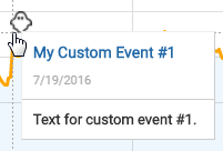
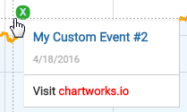
customEvents
JSON array: optional
Description: JSON array for custom chart events. See loadCustomEvents for details on all the JSON parameters. Also see loadCustomEvents and clearCustomEvents in the Methods section for additional ways to interact with custom events.
Default: NULL
Example
"customEvents": [{
    "label": "My Custom Events",
    "display": true,
    "minHorizDistance": 10,
    "minVertDistance": 20,
    "dataset": [{
        "date": "2016-07-19",
        "iconImage": "img/sm_ghost.png",
        "rolloverTitle": "My Custom Event #1",
        "rolloverBodyText": "Text for custom event #1."
    }, {
        "date": "2016-04-18T10:18:00",
        "iconCharacter": "X",
        "iconCharacterColor": "#cce6ff",
        "iconBackgroundColor": "#2BA92B",
        "rolloverTitle": "My Custom Event #2",
        "rolloverBodyHTML": "Visit <a href=\"https://www.chartworks.io\" target=\"_blank\" style=\"color:red!important\">chartworks.io</a>"
    }]
}]
or
"customEvents": [{
    "label": "My Custom Events",
    "display": true,
    "minHorizDistance": 10,
    "minVertDistance": 20,
    "datasetURL": "./events/my_custom_events.json",
    "datasetCallback": function(data){
        return data.map(function(row){
            row.iconImage = "img/location.png";
            return row;
        });
    }
}]
dependencySRI
boolean: optional
Description: Enable Subresource Integrity enforcement for all resources Chartworks adds to a page in the rendering process. For more on SRI see Chartworks JS, Versioning and Security.
Default: false
Example
"dependencySRI": true
displayExchange
string: optional
Description: By default, starting with v1.3, no exchange is appended to the symbol in the UI. If you wish to also display an exchange code you can supply a string into displayExchange for it to be displayed in the UI.
Default: NULL
Example
"displayExchange": "NASDAQ"
displaySymbol
string: optional
Description: By default the chart displays the symbol in the UI. If a value is passed for displaySymbol this value will be displayed in the UI instead of symbol. In some cases a client may wish to override the symbol and instead display an alternative symbol in the UI. For example, if the client is using the RIC symbol set and therefore must pass in 'MSFT.O' in the symbol field to chart MSFT on the NASDAQ but would rather just display 'MSFT' in the UI they can pass in "displaySymbol": "MSFT" to achieve this.
Default: NULL
Example
"displaySymbol": "MSFT"
events
array: optional
Description: Events to show on chart on load. Options are "dividends" and "splits".
Default: NULL
Example
"events": ["dividends","splits"]
exchange
string: required/optional
Description: The financial exchange code for the passed symbol. Required only if you are using the Exchange Symbol and Exchange Code as your symbol set. See Symbology.
See the full list of available exchange codes on the symbology page.
Example
"exchange": "NSQ"
extendedHours
boolean: optional
Description: Show (true) or hide (false) extended market hours on intraday charts. Only available on US exchanges. May require additional data entitlements.
Default: false
Example
"extendedHours": true
feature.attribution
boolean: optional
Description: Show (true) or hide (false) chartworks attribution under the chart with link that opens https://www.chartworks.io in a new tab.
Default: false
Example
"feature.attribution": true
feature.attribution.position
string: optional
Description: Provides options for where the attribution is displayed. By default the attribution is displayed in the bottom left under the chart. panelBottomLeft displays the attribution within the main chart panel.
Accepted Inputs:
- "panelBottomLeft" for attribution to be displayed in the bottom left of the main chart panel.
Default: NULL
Example
"feature.attribution.position": "panelBottomLeft"
feature.attribution.value
string: optional
Description: Provides ability to change the attribution string value.
Default: "chart by Chartworks"
Example
"feature.attribution.value": "My Company"
feature.comparison
boolean: optional
Description: Show (true) or hide (false) the comparison selector in the top menu. If the chart width is less than 780px the comparison selector will always be hidden.
Default: true
Example
"feature.comparison": false
feature.dataLegendOHLC
boolean: optional
Description: Show (true) or hide (false) the Open, High, Low rollover data points for chart styles that do not use Open, High, Low data points to draw (e.g. Line, Area, Dot and Bar styles) on small and large charts. See feature.small.dataLegendOHLC to set dataLegendOHLC for small charts only.
Default: false
Example
"feature.dataLegendOHLC": true
feature.events
boolean: optional
Description: Show (true) or hide (false) the events selector in the top menu. If the chart width is less than 780px the events selector will always be hidden.
Default: true
Example
"feature.events": false
feature.indicators
boolean: optional
Description: Show (true) or hide (false) the indicators selector in the top menu.
Default: true
Example
"feature.indicators": false
feature.indicators.editColors
boolean: optional
Description: Show (true) or hide (false) the color palettes in the indicator/symbol menus.
Default: true
Example
"feature.indicators.editColors": false
feature.intraday
boolean: optional
Description: Show (true) or hide (false) intraday timeframe options in the menu ('1 Day' and '5 Day') . Good to toggle to false if the security you are charting will never have intraday data (for example a Mutual Fund).
Default: true
Example
"feature.intraday": false
feature.large.timeframes
array: optional
Description: Show a custom set of timeframe options on the large chart.
Accepted Array Values:
- "1d" for 1 Day
- "5d" for 5 Days
- "10d" for 10 Days
- "20d" for 20 Days
- "1m" for 1 Month
- "3m" for 3 Months
- "6m" for 6 Months
- "ytd" for Year To Date
- "1y" for 1 Year
- "3y" for 3 Years
- "5y" for 5 Years
- "10y" for 10 Years
- "15y" for 15 Years
- "20y" for 20 Years
- "Max" for all data
Default: ["1d","5d","1m","3m","6m","ytd","1y","3y","5y","10y","Max"]
Example
"feature.large.timeframes": ["1d", "10d", "20d", "1y", "ytd", "10y", "Max"]
feature.legend.addOverlay
boolean: optional
Description: Enable (true) or disable (false) users from being able to add indicators to lower indicators.
Default: true
Example
"feature.legend.addOverlay": false
feature.legend.autoExpand
string: optional
Description: When set to "all" will automatically expand the legend if either an upper indicator or comparison is added to the chart. When set to "comparison" will automatically expand the legend if a comparison is added to the chart. By default the legend is collapsed on load and remains collapsed if a comparison or upper indicator is added.
Accepted Inputs:
- "all"
- "comparison"
Default: NULL
Example
"feature.legend.autoExpand": "all"
feature.markerType
boolean: optional
Description: Show (true) or hide (false) the marker selector in the top menu. If the chart width is less than 780px the marker selector will always be hidden.
Default: true
Example
"feature.markerType": false
feature.panZoom
boolean: optional
Description: Enable (true) or disable (false) users from being able to pan/zoom the chart.
Default: true
Example
"feature.panZoom": false
feature.events.dividends
boolean: optional
Description: Show (true) or hide (false) the Dividends option in the Event menu.
Default: true
Example
"feature.events.dividends": false
feature.events.dividends.iconImage
string: optional
Description: A base64 image or path to a local image that replaces the default dividend event icon. Base64 is recommended.
Default: null
Example
"feature.events.dividends.iconImage": "data:image/png;base64,iVBORw0KGgoAAAANSUhEUgAAABcAAAAXCAYAAADgKtSgAAAABGdBTUEAALGPC/xhBQAAAAFzUkdCAK7OHOkAAAAgY0hSTQAAeiYAAICEAAD6AAAAgOgAAHUwAADqYAAAOpgAABdwnLpRPAAAAAZiS0dEAP8A/wD/oL2nkwAAAAlwSFlzAAAASAAAAEgARslrPgAABjpJREFUSMe1lUtoXOcZhp//XGbOzJkZjUajGd0ztmRZ40i25cZObNchqVvShEJom02TQqCFdtNFvOmykFW6KDTQrlraQilJN3ahCYbSxE0cx46d2E4sW7Fl62JJc5NGmvto5pz//KeLJPYq0E0/eOGDDx544Xt54f844usO+qOv4+9sBfT4+C4tGJkRhrlXaGaPr9yaL907qtuck9XFZRHqc9StV/43uLHvt3itTd0amj0WjCV/1tfX+9TwQHQg3Rs0rKBGp6soVboyV2wUt7Yq/+nWt/7YyV+9pNspKedPfT08duwNvJ1qzOqfeCU1NPSL4wfT/U/ORMikTMKWQBfg+dDu+KxsuJyfa/Lhp6XNjXz+953yvdcNK16vXXzxofuvlvSJPyGcaqx3ePLX2anMqZefHY0+c8gm1aOjCfCUQno+nvLRNUjGNGYyQcYGI3alrZ9wpEjI2uoHsfEXuq3Vfz6EP3LsVfKfndHHD337l3snR0+98PSgsXfYQCkPR3q4UiKl90CulLjSQymPVEww3B/Uqi1v1vNcZ/niHy6MPfZTv7b2Hnooc5J9jx4nPbL7ROaRod88+Y3B6MRQACkdup0WyvPwlYcn3QdSnkS6XbrdFkopesI+dhCt1WxOR+P9HyWT/fc3mi30Jx5/hpW5f5kz+w++Or03fTSbsek0N7k3f4nC/c8oF1cIhS2CpsD3OgjfoVErsTB3gdLqHNuba1hWgGTMwJdtW+5UjLkP/vp2djKr9KOHn2Ag1T85uTv1q+x4TyygNVlfnmPfnlEOzU5jW4Lc/bske8Po7CBUi/Xlm2T3jHDo4DThgM/K4i3iUZOY5eK1t/uCung7bhtlY3zAoNXq7h/v7w4M2NvkNuo8dugAs7OzBINBMpldNOpnob1EIGDSdVxSfRGOHj2GbdtMTOwhEo2yuHCD4VSMTn93oJXw9tu2dVt7/vgIQ5FWdjTeMHqMEmHLYGoqSygU+uJXhYYd0ugNlOkxSvQGytghDSE0AEKhEFNTWcKWQY9RYjTeMAYjrezz3xzBOPK9FPPXGpF+a4towMG2oiAEjuOglCKfzxPRcgxGt75IhQ+dCuTzecbGRtE0DYTAtiAeKKNZDdJWI3LkuRT6i+MuxWJ5KjMonu1PuHSUw3YnCZgUiuuUc+8w0XuTjZVllm8uYhp1RgabrG402HFjuBLW1hax3UsMh4s41TKlteLfrdLyFeOTa3dptuV5t+bnq8Iciop7tPQiheYAYaPMgXSeu9eLXHhzEbMrWQgH+NbLExyYynO/coPCZhLTLWLXF6nVFLIq881K+fwn1ysY73yaZ3GLeVtvvrXLlj/vswV6YoU9xxNEYxrS91m7VWA04mMnTeo7ktXPc2RnJNOJAs2ax9K1Cmp7h1zLZ6llvPXGpfb8eB9oH680eGlauTfuVd+PJHR3YjZCKuCxfHUTV3VBdwgGFJGETrBHI5owME0PdAepOixfK5MyJRMHI0QSujt3r/r+S9PK/XilgTa5H66UJEtV72LZY9FPBEhP21jSp5DrIAIC3dYwe/QH0kMawoRCroslfdLTEUgEKHssLVW9i1dKksn9oJ05C7m6x+nrMl9vq1uuB1pvgHTGYnvdQekCK2Eiwjpm1ECENEIJEyUE2+sO6YyFlgjgelBvq5unr8v8et3jzFnQAGpNH9//m+t01KbcAYROOB7AbyncusfkwQh+wqCtgZ4OMDFj0615+G1FOG4CGrID3Y7a9P033XrTB76EJ22BED/G1IShpIbf0dA1Hd/1VeX2jpu2NA6f7GXfyV4OPx2nTxdU7uy4vuMrXTPwOzrK1TA1YQjxI5K2eAgPmpCJEsJnTAgd5Rp4rkajpQrn3q29tnS5cdVf7bjxtod3v+MuXa5fPXeu9lqjpQqe1FDSQGg6wmcsEyUUNL9sNYBK22e9gZzPd5cSt+tyoC4Np+1wd93J/fnf1d9dv9P9y/F91sm+mD61VfdufzjfefejlZ3mT74T/27vQms4GHIp5ttyPt9dyjWQ423/Yc0FgeeOmKyW1Uh2NPCDVMLY7Xu+vlpy3jt92fnH5KBQCwX/K6dqclCwUPC1Hz4e+P5YOvCUZghV2nIXP19zz4wltfWzV1y6wH8BhgoFdoEHRuQAAAAldEVYdGRhdGU6Y3JlYXRlADIwMTUtMTEtMjBUMTU6NTA6NTgrMDg6MDAYhRUdAAAAJXRFWHRkYXRlOm1vZGlmeQAyMDE1LTExLTE4VDEwOjMxOjM0KzA4OjAwUsYY9wAAAEd0RVh0c29mdHdhcmUASW1hZ2VNYWdpY2sgNi43LjctMTAgMjAxNC0wMy0wNiBRMTYgaHR0cDovL3d3dy5pbWFnZW1hZ2ljay5vcmdvn6KiAAAAGHRFWHRUaHVtYjo6RG9jdW1lbnQ6OlBhZ2VzADGn/7svAAAAGHRFWHRUaHVtYjo6SW1hZ2U6OmhlaWdodAAxMjAC+spiAAAAF3RFWHRUaHVtYjo6SW1hZ2U6OldpZHRoADEyMN5Wme8AAAAZdEVYdFRodW1iOjpNaW1ldHlwZQBpbWFnZS9wbmc/slZOAAAAF3RFWHRUaHVtYjo6TVRpbWUAMTQ0NzgxMzg5NHYuTUoAAAATdEVYdFRodW1iOjpTaXplADE5LjhLQkJw1rOeAAAASnRFWHRUaHVtYjo6VVJJAGZpbGU6Ly8vdXNyL3NoYXJlL25naW54L3d3dy9jcmF3bGVyL0FwcC8uLi9pbWdfZnVsbC9lbW9qaTMzLnBuZ+taP0gAAAAASUVORK5CYII="
feature.events.splits
boolean: optional
Description: Show (true) or hide (false) the Splits option in the Event menu.
Default: true
Example
"feature.events.splits": false
feature.events.splits.iconImage
string: optional
Description: A base64 image or path to a local image that replaces the default split event icon. Base64 is recommended.
Default: null
Example
"feature.events.splits.iconImage": "data:image/png;base64,iVBORw0KGgoAAAANSUhEUgAAABkAAAAZCAYAAADE6YVjAAAFjklEQVRIib2WXWwcVxWAv3NnZnd2vfbu2ps4tdMkrjGhruuYGiUSpEgNUkCUICCVkJCqIHhpX0BCKBLqMyqKKAKpFXmtIqiQSCpCSn/UNFVwC02bxBjXUWNs58eJ7Nje9drrmZ2/e3lY27GhVRAPPdKZczXn3PPNvVfn3IFPQeReAVPHIDdTzFpp1Ws50p9KSS4MTS2JzEgS6LHatorXdfT/hFR+kkeyTr/VbP9Y5exvqFy6pLI5hZ2GOEB7Na1rwbyuxWeS5fg3xotGir+q/u+Q+aNtuVTR/rmzNfOUvePhlNp+ACn0QbqIiMIYDUEFsziKnn6L+MY/w+iOfzysxM+Uji3U7gmZP9pWcrelX0nt2rrX6j2CtD0CIghgABEw5u5kYwxm4RLJ2IuE1+5cqM8Ej5eOLcx/ImT6p225Qmf6bKqnY6/d+xSS2QIimNXIjcFm9SEAxmD8OeKx44Tjty8s3gq+sv2Xd1dkrQ1+fyhL34PZ59yu/Lft3YfBbUVMHaN90D4kDZXEx6yOWfPpOiiFyrUj4XinCqKW/ox+9eTVaDPk+cMtA007c8dTOz9nSb4HjM/8/Az/uDxCtbrA1rYUoj3Q3rodHb3CxNVxMq4mm04Qy0GxDEFl4D5Ln3luyJ9Zh/zoUTg4UHjW3ZkfVKUeEoHTL5/l1ZN/IdXUTHOxSEdbAomHJB4maUBuzgbcmLzO6ydPU66U6flMK0qBxHOWWQldr17703s3Vrf09SdbcvsfLUxleraUaOvl1J+voCXFwcf30uLUER1jVk9k87kYUDZLkcsbr1xAmZDvHHoQFsbwx+fmh/662PXVE0s1G6Cr3em3m1MlHBuSCnv27aC73UKicYhjMKuKWU0tgCBig9jkxeaJQ51MzCaQVMCxsZtTpa52px94VwG05FSfuDYoC6Iq3uwU1ycn0UkVYzzCOOCdi3MsexEGw7IX8c7FOcI4wBgPnVS5PjmJNzsFURWUhbg2LTnVB2ADuK7KNQpAIxqaCza/e/EjmjI2dtrCr0VkWl32DRYRNJmsYni0zN/O3yaTc4iDhBU/5ntHdiNJ0ihWkUbeNUjNT7xsEoEOMCLsaoXvP93N6EiF+nJEa0eewc8XsI3H2qQf/HA7Fy8vUr7t4zY79PUX6XATjE4g0ZBE1PzEW4dMV/RYKYxBB2AJiKGjydDx5Sw4AtqA8jZVcNbA/kEH9qYhNhDVkUQwIqA1OoiZrugxAAXw2of10WglLhudgK0RSyO2RkQjJkFs01DHwAYVh4afBFEalAZLY7QmWonLr31YH12HnHjfW6wuxG+aUIMCY4OxpGHtDdbaoGvvLcGoVbUayzShplqO3zzxvre4vl0TS+iRieCF0o70t1J5OyWOanhsMAreeLuKX014+JEm8nmLcjnm0ns17u92+eJgDhFpfG4MJtDElTAcmQhemFhCb2or58eDW4cfSnXn25w90mSDq5CUgAXbH3D54O1lhs8tc2lomX8N++RaHQ4eKqJEEEsatROBLkfcGFt56fDx8vNL4X9AlgJ0Utd/39dpf81tsbeKayG2ICLYltC7N4dbsCmWHB76UguPfb2AtdqeRQuEoMsx5Y9WRn9xqvrk2Ylo6b+6MMCdm3FtJdDn9rSpA5mM2iKWQlQjkYVwX6fDA5/NsG2bjaUF0SAhmBWNnotYuLIy9uuXq0+cPO9d23hHboJUgfGpaP7qTHimN0dn3pbdIqLudi1pdJZEIDTgaUwlJpoO4vHLy3985qXKkVPv+hO32CyfeMcXMrjPfrPlwGMD2ac770/tTxfsgmSsRh0lBuNrgsVo8dbNYOjcsP/bn51eemvRp/5xue75t+I6uPt3OR3f/UJmoLvd7stmVJPn65WJ2Xj0Dx/4w0PXotv16OOTf6ryb733qQA8X0wCAAAAAElFTkSuQmCC"
feature.indicators.menuType
string: optional
Description: Present a simple dropdown menu for selecting indicators to add to the chart, rather than the default panels offering selection by search or category. This dropdown menu includes subsections for upper and lower indicators, depending on which may have been enabled using (feature.indicators.options)[#html5-config-options]. Set this property to "list" to enable this option.
The dropdown has a max height of 350 and a min height of 50. Otherwise, its height is dynamic based on the chart height.
Default: NULL
Example
"feature.indicators.menuType": "list"
feature.indicators.lowerLimit
int: optional
Description: Limit the number of lower indicators the user may add to a chart. When this limit is reached, attempting to add one more will result in a warning dialog until an existing lower indicator is removed.
Default: NULL
Example
"feature.indicators.lowerLimit": 2
feature.indicators.options
array: optional
Description: Specify the indicators that should be visible and selectable in the Chartworks UI. Provide an array of indicator ids from the lists under addIndicator().
Default: NULL
Example
"feature.indicators.options": ["adl","avgtruerange","sma","ema","wma"]
feature.indicators.params
object: optional
Description: Customize the default settings for upper and lower indicators added to the chart, by providing this object keyed by indicator ID. See addIndicator() for the list of settable parameters for each indicator ID, and note that not all indicators have settable options. Settings specified in this property will override the Chartworks defaults, and will in turn be overridden by custom parameters specified when calling addIndicator().
Default: NULL
Example
"feature.indicators.params": {
    "volumebyprice": {
        "inputs": {
            "numBars": 10
        }
    },
    "avgtruerange": {
        "inputs": {
            "period": 20
        }
    }
}
feature.indicators.upperLimit
int: optional
Description: Limit the number of upper indicators the user may add to a chart. When this limit is reached, attempting to add one more will result in a warning dialog until an existing upper indicator is removed.
Default: NULL
Example
"feature.indicators.upperLimit": 4
feature.saveLoad
boolean: optional
Description: Show (true) or hide (false) the save/load icon in the top menu and allow users to save/load both saved templates and saved charts.
- Save/Load template: saves the users chart settings including indicators, timeframe and styles as a named template. It does not save the symbol or chart drawings/annotations.
- Save/Load chart: saves the users chart and settings including symbol, drawings/annotations, indicators, timeframe and styles as a named chart.
If the chart width is less than 780px the save/load icon will always be hidden.
Default: false
Example
"feature.saveLoad": true
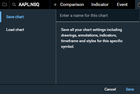
feature.saveLoadCharts
boolean: optional
Description: Show (true) or hide (false) the save/load icon in the top menu with only the 'Save chart' and 'Load chart' as an option.
- Save/Load chart: saves the users chart and settings including symbol, drawings/annotations, indicators, timeframe and styles as a named chart.
If the chart width is less than 780px the save/load icon will always be hidden.
Default: false
Example
"feature.saveLoadCharts": true
feature.saveLoadDefaultTemplate
boolean: optional
Description: Show (true) or hide (false) the option to save a new template as the "default" template, which will be automatically applied on later chart loads. This also marks the default template with an asterisk in the list of saved templates. This option only has an effect when saving templates is enabled with feature.saveLoad or feature.saveLoadTemplates.
Default: false
Example
"feature.saveLoadDefaultTemplate": true
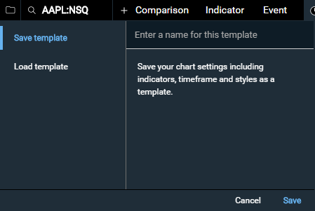
feature.saveLoadTemplates
boolean: optional
Description: Show (true) or hide (false) the save/load icon in the top menu with only 'Save template' and 'Load template' as options.
- Save/Load template: saves the users chart settings including indicators, timeframe and styles as a named template. It does not save the symbol or chart drawings/annotations.
If the chart width is less than 780px the save/load icon will always be hidden.
Default: false
Example
"feature.saveLoadTemplates": true
feature.settings
boolean: optional
Description: Show (true) or hide (false) settings menu on the large chart template. By default, when set to true only the feature.settings.print and feature.settings.downloadImage sub menu items will appear. To enable/disable specific setting menu items see the list below.
Default: false
Example
"feature.settings": true
feature.settings.downloadImage
boolean: optional
Description: Show (true) or hide (false) the 'Download Image' option in the settings menu.
Default: false, if feature.settings is set to true default becomes true
Example
"feature.settings.downloadImage": true
feature.settings.extendedHours
boolean: optional
Description: Show (true) or hide (false) the 'Extended Hours' option in the settings menu. Also see extendedHours for details on what Extended Hours are.
Default: false
Example
"feature.settings.extendedHours": true
feature.settings.indicatorFlags
boolean: optional
Description: Show (true) or hide (false) the 'Show Indicator Flags' option in the settings menu. Also see showIndicatorFlags for details on what Indicator Flags are.
Default: false
Example
"feature.settings.indicatorFlags": true
feature.settings.indicatorLegendValues
boolean: optional
Description: Show (true) or hide (false) the 'Show Indicator Values' option in the settings menu. Also see showIndicatorLegendValues for details on what Indicator Values are.
Default: false
Example
"feature.settings.indicatorLegendValues": true
feature.settings.print
boolean: optional
Description: Show (true) or hide (false) the 'Print' option in the settings menu.
Default: false, if feature.settings is set to true default becomes true
Example
"feature.settings.print": true
feature.settings.reset
boolean: optional
Description: Show (true) or hide (false) the 'Reset Chart' option in the settings menu. Also see the reset() method for the same functionality you can use programmatically. Showing the 'Reset Chart' option is a good idea if you are using persistentSettings.
Default: false
Example
"feature.settings.reset": true
feature.share
boolean: optional
Description: Show (true) or hide (false) the share button in the top menu. Note that the onShare event must be defined for the share button to appear.
Default: false
Example
"feature.share":true
feature.symbolSearch
boolean: optional
Description: Show (true) or hide (false) the symbol search in the top menu. If the chart width is less than 780px the symbol search will always be hidden.
Default: true
Example
"feature.symbolSearch":false
feature.timeframe
boolean: optional
Description: Show (true) or hide (false) the timeframe and frequency selectors in the top menu. If the chart width is less than 780px the timeframe and frequency selectors will always be hidden.
Default: true
Example
"feature.timeframe": false
feature.tools
boolean: optional
Description: Show (true) or hide (false) the tools menu on the left side. If the chart width is less than 780px the tools menu will always be hidden. The list of tools presented to users can be customized using the feature.tools.options parameter.
Default: true
Example
"feature.tools": false
feature.tools.options
array: optional
Description: Provide a custom list of interactive charting tools. The full list of available options is:
- "crosshair"
- "text"
- "line"
- "measurementline"
- "horizontal"
- "ray"
- "extended"
- "arrow"
- "ellipse"
- "rect"
- "fibonacci"
- "fibonacci-extended"
- "fibarc"
- "fibcircle"
- "gannfan"
When feature.tools is disabled, this parameter has no effect.
Default: ["crosshair", "text", "line", "measurementline", "horizontal", "ray", "extended", "arrow", "ellipse", "rect"]
Example
"feature.tools.options": ["crosshair", "line", "measurementline"]
feature.small.comparison
boolean: optional
Description: Show (true) or hide (false) the comparison menu on the small chart. See Chart Breakpoints and template.size for more details on the small chart.
Default: false
Example
"feature.small.comparison":true
feature.small.dataLegend
boolean: optional
Description: Show (true) or hide (false) the rollover data legend on the small chart. See Chart Breakpoints and template.size for more details on the small chart.
Default: false
Example
"feature.small.dataLegend":true
feature.small.dataLegendOHLC
boolean: optional
Description: Show (true) or hide (false) the Open, High, Low rollover data points for chart styles that do not use Open, High, Low data points to draw (e.g. Line, Area, Dot and Bar styles) on small charts. Note, feature.small.dataLegend must be set to true for feature.small.dataLegendOHLC to display. See feature.dataLegendOHLC to set dataLegendOHLC for both small and large charts at once. See Chart Breakpoints and template.size for more details on the small chart.
Default: false
Example
"feature.small.dataLegendOHLC":true
feature.small.timeframes
array: optional
Description: Show a custom set of timeframe options on the small chart.
Accepted Array Values:
- "1d" for 1 Day
- "5d" for 5 Days
- "10d" for 10 Days
- "20d" for 20 Days
- "1m" for 1 Month
- "3m" for 3 Months
- "6m" for 6 Months
- "ytd" for Year To Date
- "1y" for 1 Year
- "3y" for 3 Years
- "5y" for 5 Years
- "10y" for 10 Years
- "15y" for 15 Years
- "20y" for 20 Years
- "Max" for all data
Default: ["1d","1m","3m","6m","ytd","1y","3y","5y","10y"]
Example
"feature.small.timeframes": ["1d","5d","1m","3m","6m","ytd"]
id
string: optional
Description: An id is required when using persistentSettings. It should be a unique string that identifies your chart. Only persistent settings associated with this id will be loaded for this chart. For example, if you have a small chart with no upper/lower indicator menus on a Summary page and a much more detailed chart on a Charts page that has all of the charting options like upper/lower indicators enabled you'd want to give these two charts their own id so settings from one aren't loaded on the other (see the example below).
Default: NULL
Example
var largeChart = new ChartworksBuilder({
    "token": "demo-token",
    "target": "#lgChartTarget",
    "symbol": "AAPL",
    "exchange": "NSQ",
    "template.size": "large",
    "persistentSettings": "session",
    "id": "large_chart"
});

var smallChart = new ChartworksBuilder({
    "token": "demo-token",
    "target": "#smChartTarget",
    "symbol": "AAPL",
    "exchange": "NSQ",
    "template.size": "small",
    "persistentSettings": "session",
    "id": "small_chart"
});
interval
int: optional
Description: The interval of the frequency. For interday charts anything but 1 is ignored. Used in conjunction with period to set the frequency of the timeframe.
Accepted Inputs:
- 1
- 3
- 5
- 15
Default: NULL
Example
"interval": 1
panel.lower.indicator
string or JSON array of objects: optional
Description: Lower indicator(s) to include on chart when chart is loaded.
Accepted String Inputs:
Any one of the ID strings in the Lower Indicators list.
Accepted JSON Array Inputs:
See examples below and Indicators for a full list of accepted id and params inputs for lower indicators.
Default: NULL
Example
"panel.lower.indicator": "macd"
or
"panel.lower.indicator": [{"id":"macd"}]
or
"panel.lower.indicator": [{"id":"macd", "params":{"fastperiod":14, "slowperiod":28, "smoothing":10}}]
or
"panel.lower.indicator": [{"id":"macd"}, {"id":"momentum"}]
or
"panel.lower.indicator": [{"id":"macd", "params":{"fastperiod":14, "slowperiod":28, "smoothing":10}}, {"id":"momentum", "params": {"period":30}}]
panel.lower.size.height
integer: optional
Description: Height in pixels of the lower chart panel.
Default: 100
Example
"panel.lower.size.height": 150
panel.lower.size.percent
integer: optional
Description: The height in percent of the lower chart panel.
Default: Disabled by default
Example
"panel.lower.size.percent": 20
panel.upper.indicator
string or JSON array of objects: optional
Description: Upper indicator(s) to include on chart when chart is loaded.
Accepted String Inputs:
Any one of the ID strings in the Upper Indicators list.
Accepted JSON Array Inputs:
See examples below and Indicators for a full list of accepted id and params inputs for upper indicators.
Default: NULL
Example
"panel.upper.indicator": "sma"
or
"panel.upper.indicator": [{"id":"sma"}]
or
"panel.upper.indicator": [{"id":"sma", "params":{"period":14}}]
or
"panel.upper.indicator": [{"id":"sma"}, {"id":"bollinger"}]
or
"panel.upper.indicator": [{"id":"sma", "params":{"period":14}}, {"id":"bollinger", "params": {"period":30,"standardDeviations":3}}]
panel.upper.size.height
integer: optional
Description: Height in pixels of the upper chart panel (does not include the menu height). Note that an additional ~40px will be added to this height for the x-axis labels.
Default: 300
Example
"panel.upper.size.height": 500
period
string: optional
Description: The period of the frequency. Used in conjunction with interval to set the frequency of the timeframe.
Accepted Inputs:
- "Minute"
- "Hour"
- "Day"
- "Week"
- "Month"
Default: NULL
Example
"period": "Day"
persistentSettings
string: optional
Description: When set to "session" and id is set to a string, Web Storage (specifically sessionStorage) is used to save all chart settings (except drawings) as the user updates and interacts with the chart. An id is required when using persistentSettings. Any new chart loaded in the same session with the same id and persistentSettings set to "session" will load a chart with the last settings the previous chart had. See sessionStorage for more details on how long the data storage is kept. This is a particularly useful feature when users are navigating to different pages researching different securities to always load the same settings they left the last chart with. id is used to differentiate your charts. For example, if you have a small chart with no upper/lower indicator menus on a Summary page and a much more detailed chart on a Charts page that has all of the charting options like upper/lower indicators enabled you'd want to give these two charts their own id so settings from one aren't loaded on the other. See id for more information. In addition, when using persistentSettings it's a good idea to expose either the feature.settings.reset settings menu option or your own reset button/link with reset() that allows the user to fully reset the chart back to its original config.
Accepted Inputs:
- "session"
Default: NULL
Example
new ChartworksBuilder({
    "token": "demo-token",
    "target": "#chartTarget",
    "symbol": "AAPL",
    "exchange": "NSQ",
    "persistentSettings": "session",
    "id": "large_equity_chart"
});
poll.rate
integer: optional
Description: Poll rate in seconds; minimum poll rate is 10 seconds. Polling defaults to off on load (0 seconds). When poll.rate is passed into the chart config the chart will start to poll for new data after the chart load has completed. For options to start or stop the poll after chart load has completed see startPoll and stopPoll. Our recommendation is to set the poll.rate at 60 seconds as that is the minimum frequency on any timeframe.
Default: 0
Example
"poll.rate": 60
realTime
boolean: optional
Description: If the user_tier (see Authentication section) is entitled to real-time exchange data the realTime parameter can be set to true to get back real-time charting data. If the realTime parameter is set to true but the user_tier is not entitled to real-time data the chart will default back to displaying delayed data. Setting the realTime parameter to false will return delayed charting data. Number of minutes intraday data is delayed varies by exchange.
Default: false
Example
"realTime": true
shadowTarget
string: optional
Description: If the HTML element where the chart will be loaded is within a shadowRoot (such as in a Web Component), define the shadowRoot parent selector here, eg "chartworks-element". Alternatively, you can pass a shadowRoot element reference directly, which can be useful if the web component is nested. See also target.
Example (selector)
"shadowTarget": "chartworks-element"Example (DOM reference)
"shadowTarget": this.shadowRootshowAllMouseoverDecimalPoints
boolean: optional
Description: By default the rollover price data displayed on the chart does not include decimal places when values are above 1K to save space. Setting showAllMouseoverDecimalPoints to true will always show decimal places for rollovers.
Default: false
Example
"showAllMouseoverDecimalPoints": true
showIndicatorFlags
boolean: optional
Description: When set to true any upper indicators added to the chart will also show their last value(s) in a color matching y-axis flag.
Default: false
Example
"showIndicatorFlags": true
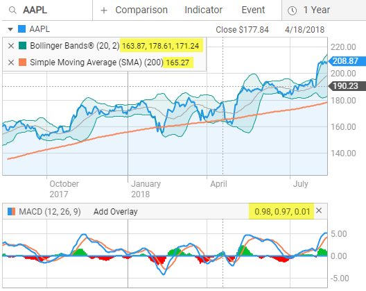
showIndicatorLegendValues
boolean: optional
Description: When set to true all upper and lower indicator values are shown on the chart. By default only the primary Price rollover data is displayed on the chart. Also see feature.settings.indicatorLegendValues for the corresponding settings menu option.
Default: false
Example
"showIndicatorLegendValues": true
Indicator rollover values are highlighted in yellow below.
showMajorCurrency
boolean: optional
Description: If an instrument prices in both major and minor currencies (like British Pounds and Pence) this can be used to choose the preferred currency. May cause errors if used at the same time as the "currency" input.'
Default: false
Example
"showMajorCurrency": truestyle.axis.fontColor
string: optional
Description: Style option for the chart axis text color
Default: "#999999"
Example:
"style.axis.fontColor": "#000000"style.axis.fontSize
number: optional
Description: Style option for the chart axis font size
Default: 12
Example:
"style.axis.fontSize": 14style.axis.fontFamily
string: optional
Description: Style option for the chart axis font family
Default: "Roboto"
Example:
"style.axis.fontFamily": "Verdana"style.grid.lineColor
string: optional
Description: Style option for the primary grid line color
Default: "#DDDDDD"
Example:
"style.grid.lineColor": "#000000"style.grid.lineColorAlt
string: optional
Description: Style option for alternate grid line color, which is used for major time divisions (For example, between years on a three-year timeframe)
Default: "#AAAAAA"
Example:
"style.grid.lineColorAlt": "#000000"style.indicator.adl.lineColor
string: optional
Description: Style option for Accumulation / Distribution indicator.
Default: "#FCD32E"
Example
"style.indicator.adl.lineColor": "#04bbd3"
style.indicator.adl.lineWidth
number: optional
Description: Style option for Accumulation / Distribution indicator.
Default: 2
Example
"style.indicator.adl.lineWidth": 4
style.indicator.avgtruerange.lineColor
string: optional
Description: Style option for Average True Range indicator.
Default: "#4B7BBB"
Example
"style.indicator.avgtruerange.lineColor": "#04bbd3"
style.indicator.avgtruerange.lineWidth
number: optional
Description: Style option for Average True Range indicator.
Default: 2
Example
"style.indicator.avgtruerange.lineWidth": 4
style.indicator.awesomeoscillator.fillColorPos
string: optional
Description: Style option for Awesome Oscillator indicator.
Default: "#00C02F"
Example
"style.indicator.awesomeoscillator.fillColorPos": "#04bbd3"
style.indicator.awesomeoscillator.fillColorNeg
string: optional
Description: Style option for Awesome Oscillator indicator.
Default: "#FD0000"
Example
"style.indicator.awesomeoscillator.fillColorNeg": "#04bbd3"
style.indicator.percentb.lineColor
string: optional
Description: Style option for Bollinger Band %B indicator.
Default: "#009487"
Example
"style.indicator.percentb.lineColor": "#04bbd3"
style.indicator.percentb.medianLineColor
string: optional
Description: Style option for Bollinger Band %B indicator.
Default: "#04BBD3"
Example
"style.indicator.percentb.medianLineColor": "#04bbd3"
style.indicator.percentb.lineWidth
number: optional
Description: Style option for Bollinger Band %B indicator.
Default: 2
Example
"style.indicator.percentb.lineWidth": 4
style.indicator.bollinger.fillColor
string: optional
Description: Style option for Bollinger Bands indicator.
Default: "rgba(0,148,135,0.1)"
Example
"style.indicator.bollinger.fillColor": "#04bbd3"
style.indicator.bollinger.lineColor
string: optional
Description: Style option for Bollinger Bands indicator.
Default: "#009487"
Example
"style.indicator.bollinger.lineColor": "#04bbd3"
style.indicator.bollinger.lineColorSMA
string: optional
Description: Style option for Bollinger Bands indicator.
Default: "#9D9D9D"
Example
"style.indicator.bollinger.lineColorSMA": "#04bbd3"
style.indicator.bollinger.lineWidth
number: optional
Description: Style option for Bollinger Bands indicator.
Default: 1
Example
"style.indicator.bollinger.lineWidth": 2
style.indicator.bollingerbandwidth.lineColor
string: optional
Description: Style option for Bollinger Band Width indicator.
Default: "#4B7BBB"
Example
"style.indicator.bollingerbandwidth.lineColor": "#04bbd3"
style.indicator.bollingerbandwidth.lineWidth
number: optional
Description: Style option for Bollinger Band Width indicator.
Default: 2
Example
"style.indicator.bollingerbandwidth.lineWidth": 4
style.indicator.chaikins.lineColor
string: optional
Description: Style option for Chaikin's Volatility indicator.
Default: "#2496F1"
Example
"style.indicator.chaikins.lineColor": "#04bbd3"
style.indicator.chaikins.lineWidth
number: optional
Description: Style option for Chaikin's Volatility indicator.
Default: 2
Example
"style.indicator.chaikins.lineWidth": 4
style.indicator.dividendyield.lineColor
string: optional
Description: Style option for Dividend Yield indicator.
Default: "#04BBD3"
Example
"style.indicator.dividendyield.lineColor": "#04bbd3"
style.indicator.dividendyield.lineWidth
number: optional
Description: Style option for Dividend Yield indicator.
Default: 2
Example
"style.indicator.dividendyield.lineWidth": 4
style.indicator.dmi.lineWidthADX
number: optional
Description: Style option for Directional Moving Index (DMI) indicator.
Default: 2
Example
"style.indicator.dmi.lineWidthADX": 4
style.indicator.dmi.lineColorADX
string: optional
Description: Style option for Directional Moving Index (DMI) indicator.
Default: "#9D9D9D"
Example
"style.indicator.dmi.lineColorADX": "#04bbd3"
style.indicator.dmi.lineColorDINeg
string: optional
Description: Style option for Directional Moving Index (DMI) indicator.
Default: "#04BBD3"
Example
"style.indicator.dmi.lineColorDINeg": "#04bbd3"
style.indicator.dmi.lineColorDIPos
string: optional
Description: Style option for Directional Moving Index (DMI) indicator.
Default: "#F98254"
Example
"style.indicator.dmi.lineColorDIPos": "#04bbd3"
style.indicator.ema.lineWidth
number: optional
Description: Style option for Exponential Moving Average indicator.
Default: 1
Example
"style.indicator.ema.lineWidth": 2
style.indicator.highlow.highColor
string: optional
Description: Style option for High/Low Price indicator.
Default: "#9D9D9D"
Example
"style.indicator.highlow.highColor": "#04bbd3"
style.indicator.highlow.lowColor
string: optional
Description: Style option for High/Low Price indicator.
Default: "#9D9D9D"
Example
"style.indicator.highlow.lowColor": "#04bbd3"
style.indicator.ichimokucloud.lineColorChikouSpan
string: optional
Description: Style option for Ichimoku Cloud indicator.
Default: "#FE6262"
Example
"style.indicator.ichimokucloud.lineColorChikouSpan": "#04bbd3"
style.indicator.ichimokucloud.lineColorKijunSen
string: optional
Description: Style option for Ichimoku Cloud indicator.
Default: "#FF9898"
Example
"style.indicator.ichimokucloud.lineColorKijunSen": "#04bbd3"
style.indicator.ichimokucloud.lineColorSenkouSpanA
string: optional
Description: Style option for Ichimoku Cloud indicator.
Default: "green"
Example
"style.indicator.ichimokucloud.lineColorSenkouSpanA": "#04bbd3"
style.indicator.ichimokucloud.lineColorSenkouSpanB
string: optional
Description: Style option for Ichimoku Cloud indicator.
Default: "red"
Example
"style.indicator.ichimokucloud.lineColorSenkouSpanB": "#04bbd3"
style.indicator.ichimokucloud.lineColorTenkanSen
string: optional
Description: Style option for Ichimoku Cloud indicator.
Default: "#66FFF2"
Example
"style.indicator.ichimokucloud.lineColorTenkanSen": "#04bbd3"
style.indicator.ichimokucloud.lineWidthChikouSpan
number: optional
Description: Style option for Ichimoku Cloud indicator.
Default: 1.25
Example
"style.indicator.ichimokucloud.lineWidthChikouSpan": 2.5
style.indicator.ichimokucloud.lineWidthKijunSen
number: optional
Description: Style option for Ichimoku Cloud indicator.
Default: 1.25
Example
"style.indicator.ichimokucloud.lineWidthKijunSen": 2.5
style.indicator.ichimokucloud.lineWidthSenkouSpanA
number: optional
Description: Style option for Ichimoku Cloud indicator.
Default: 1.25
Example
"style.indicator.ichimokucloud.lineWidthSenkouSpanA": 2.5
style.indicator.ichimokucloud.lineWidthSenkouSpanB
number: optional
Description: Style option for Ichimoku Cloud indicator.
Default: 1.25
Example
"style.indicator.ichimokucloud.lineWidthSenkouSpanB": 2.5
style.indicator.ichimokucloud.lineWidthTenkanSen
number: optional
Description: Style option for Ichimoku Cloud indicator.
Default: 1.25
Example
"style.indicator.ichimokucloud.lineWidthTenkanSen": 2.5
style.indicator.ichimokucloud.fillColorSenkouPos
string: optional
Description: Style option for Ichimoku Cloud indicator.
Default: "rgba(73, 184, 64, 0.3)"
Example
"style.indicator.ichimokucloud.fillColorSenkouPos": "#04bbd3"
style.indicator.ichimokucloud.fillColorSenkouNeg
string: optional
Description: Style option for Ichimoku Cloud indicator.
Default: "rgba(255, 0, 0, 0.2)"
Example
"style.indicator.ichimokucloud.fillColorSenkouNeg": "#04bbd3"
style.indicator.rollingdividend.lineColor
string: optional
Description: Style option for Historical Dividend indicator.
Default: "#04BBD3"
Example
"style.indicator.rollingdividend.lineColor": "#04bbd3"
style.indicator.rollingdividend.lineWidth
number: optional
Description: Style option for Historical Dividend indicator.
Default: 2
Example
"style.indicator.rollingdividend.lineWidth": 4
style.indicator.linearregression.lineWidth
number: optional
Description: Style option for Linear Regression indicator.
Default: 1
Example
"style.indicator.linearregression.lineWidth": 2
style.indicator.macd.lineColor
string: optional
Description: Style option for Moving Average Convergence Divergence (MACD) indicator.
Default: "#2496F1"
Example
"style.indicator.macd.lineColor": "#04bbd3"
style.indicator.macd.lineColorEMA
string: optional
Description: Style option for Moving Average Convergence Divergence (MACD) indicator.
Default: "#F98254"
Example
"style.indicator.macd.lineColorEMA": "#04bbd3"
style.indicator.macd.fillColorPos
string: optional
Description: Style option for Moving Average Convergence Divergence (MACD) indicator.
Default: "#00C02F"
Example
"style.indicator.macd.fillColorPos": "#04bbd3"
style.indicator.macd.fillColorNeg
string: optional
Description: Style option for Moving Average Convergence Divergence (MACD) indicator.
Default: "#FD0000"
Example
"style.indicator.macd.fillColorNeg": "#04bbd3"
style.indicator.macd.lineWidth
number: optional
Description: Style option for Moving Average Convergence Divergence (MACD) indicator.
Default: 2
Example
"style.indicator.macd.lineWidth": 4
style.indicator.mae.lineColor
string: optional
Description: Style option for Moving Average Envelope indicator.
Default: "#76C147"
Example
"style.indicator.mae.lineColor": "#04bbd3"
style.indicator.mae.fillColor
string: optional
Description: Style option for Moving Average Envelope indicator.
Default: "rgba(118,193,71,0.1)"
Example
"style.indicator.mae.fillColor": "#04bbd3"
style.indicator.mae.lineWidth
number: optional
Description: Style option for Moving Average Envelope indicator.
Default: 1
Example
"style.indicator.mae.lineWidth": 2
style.indicator.massindex.lineColor
string: optional
Description: Style option for Mass Index indicator.
Default: "#4B7BBB"
Example
"style.indicator.massindex.lineColor": "#04bbd3"
style.indicator.massindex.lineColorSetup
string: optional
Description: Style option for Mass Index indicator.
Default: "#E220A8"
Example
"style.indicator.massindex.lineColorSetup": "#04bbd3"
style.indicator.massindex.lineColorTrigger
string: optional
Description: Style option for Mass Index indicator.
Default: "#009487"
Example
"style.indicator.massindex.lineColorTrigger": "#04bbd3"
style.indicator.massindex.lineWidth
number: optional
Description: Style option for Mass Index indicator.
Default: 2
Example
"style.indicator.massindex.lineWidth": 4
style.indicator.momentum.lineWidth
number: optional
Description: Style option for Momentum indicator.
Default: 2
Example
"style.indicator.momentum.lineWidth": 4
style.indicator.momentum.lineColor
string: optional
Description: Style option for Momentum indicator.
Default: "#F98254"
Example
"style.indicator.momentum.lineColor": "#04bbd3"
style.indicator.momentum.fillColor
string: optional
Description: Style option for Momentum indicator.
Default: "rgba(250,131,84,0.1)"
Example
"style.indicator.momentum.fillColor": "#04bbd3"
style.indicator.moneyflow.lineColor
string: optional
Description: Style option for Money Flow indicator.
Default: "#9D9D9D"
Example
"style.indicator.moneyflow.lineColor": "#04bbd3"
style.indicator.moneyflow.lineWidth
number: optional
Description: Style option for Money Flow indicator.
Default: 2
Example
"style.indicator.moneyflow.lineWidth": 4
style.indicator.moneyflowindex.lineColor
string: optional
Description: Style option for Money Flow Index indicator.
Default: "#192F41"
Example
"style.indicator.moneyflowindex.lineColor": "#04bbd3"
style.indicator.moneyflowindex.lineWidth
number: optional
Description: Style option for Money Flow Index indicator.
Default: 2
Example
"style.indicator.moneyflowindex.lineWidth": 4
style.indicator.onbalancevolume.lineColor
string: optional
Description: Style option for On Balance Volume indicator.
Default: "#9D9D9D"
Example
"style.indicator.onbalancevolume.lineColor": "#04bbd3"
style.indicator.onbalancevolume.lineWidth
number: optional
Description: Style option for On Balance Volume indicator.
Default: 2
Example
"style.indicator.onbalancevolume.lineWidth": 4
style.indicator.price.fillGradient
string: optional
Description: When a chart is using a marker type of area, fill the area under the price line with a transparent gradient using the current fill color.
Default: false
Example
"style.indicator.price.fillGradient": true
style.indicator.pricechannel.lineColor
string: optional
Description: Style option for Price Channel indicator.
Default: "#DD4BF9"
Example
"style.indicator.pricechannel.lineColor": "#04bbd3"
style.indicator.pricechannel.fillColor
string: optional
Description: Style option for Price Channel indicator.
Default: "rgba(221,75,249,0.1)"
Example
"style.indicator.pricechannel.fillColor": "#04bbd3"
style.indicator.pricechannel.lineWidth
number: optional
Description: Style option for Price Channel indicator.
Default: 1
Example
"style.indicator.pricechannel.lineWidth": 2
style.indicator.previousclose.lineColor
string: optional
Description: Style option for Previous Close indicator.
Default: "#192F41"
Example
"style.indicator.previousclose.lineColor": "#192F41"
style.indicator.previousclose.lineWidth
string: optional
Description: Style option for Previous Close indicator.
Default: "1"
Example
"style.indicator.previousclose.lineWidth": "1"
style.indicator.previousclose.textColor
string: optional
Description: Style option for Previous Close indicator.
Default: "#192F41"
Example
"style.indicator.previousclose.textColor": "#192F41"
style.indicator.previousclose.textSize
string: optional
Description: Style option for Previous Close indicator.
Default: "12"
Example
"style.indicator.previousclose.textSize": "12"
style.indicator.previousclose.textFamily
string: optional
Description: Style option for Previous Close indicator.
Default: "Roboto"
Example
"style.indicator.previousclose.textFamily": "Roboto"
style.indicator.previousclose.glowColor
string: optional
Description: Style option for Previous Close indicator.
Default: "#FFFFFF"
Example
"style.indicator.previousclose.glowColor": "#FFFFFF"
style.indicator.price.fillColor
string: optional
Description: Fill color of the Area price styles.
Default: "rgba(95, 179, 241, 0.13)"
Examples
"style.indicator.price.fillColor": "orange"
or
"style.indicator.price.fillColor": "#ffa500"
or
"style.indicator.price.fillColor": "rgba(255, 165, 0, 0.8)"
style.indicator.price.lineColor
string: optional
Description: Color of the price line. Applies to all price styles except OHLC, HLC and Candlestick.
Default: "#2496f1"
Examples
"style.indicator.price.lineColor": "orange"
or
"style.indicator.price.lineColor": "#ffa500"
or
"style.indicator.price.lineColor": "rgba(255, 165, 0, 0.8)"
style.indicator.price.lineColorDown
string: optional
Description: Color of the down price marker. Applies to OHLC, HLC and Candlestick price styles.
Default: "#fd0000" for non "cultureCode":"ja-JP" charts, "#00c02f" for "cultureCode":"ja-JP" charts.
Examples
"style.indicator.price.lineColorDown": "red"
or
"style.indicator.price.lineColorDown": "#ff0000"
or
"style.indicator.price.lineColorDown": "rgba(255, 0, 0, 0.5)"
style.indicator.price.lineColorNeutral
string: optional
Description: Color of the neutral price marker. Applies to OHLC, HLC and Candlestick price styles.
Default: "#999999"
Examples
"style.indicator.price.lineColorNeutral": "gray"
or
"style.indicator.price.lineColorNeutral": "#808080"
or
"style.indicator.price.lineColorNeutral": "rgba(128, 128, 128, 0.8)"
style.indicator.price.lineColorUp
string: optional
Description: Color of the up price marker. Applies to OHLC, HLC and Candlestick price styles.
Default: "#00c02f" for non "cultureCode":"ja-JP" charts, "#fd0000" for "cultureCode":"ja-JP" charts.
Examples
"style.indicator.price.lineColorUp": "green"
or
"style.indicator.price.lineColorUp": "#008000"
or
"style.indicator.price.lineColorUp": "rgba(0, 128, 0, 0.8)"
style.indicator.price.lineWidth
integer: optional
Description: Width of the price line. Applies to the Area and Line price styles.
Default: 2
Example
"style.indicator.price.lineWidth": 3
style.indicator.price.markerType
string: optional
Description: Marker style used for the price chart.
Accepted Inputs:
- "area"
- "bar"
- "candlestick"
- "dot"
- "hlc"
- "line"
- "ohlc"
Default: "area"
Example
"style.indicator.price.markerType": "candlestick"
style.indicator.price.markerType.candlestickFillRule
string: optional
Description: Allows you to pick which calculation is used to display candlesticks. By default the Chartworks candlesticks use a common color, fill/hollow calculation that takes into account the previous candle's close price to determine the current candle's color. The default candlestick calculation is as follows:
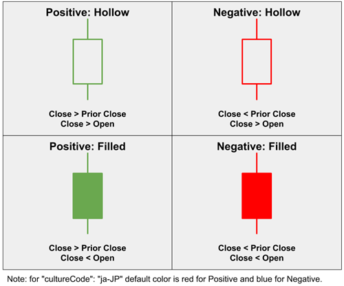
Alternatively you can pass in "openClose" if you'd like the candlesticks to instead be calculated based only on the open/close price of the current candlestick showing hollow candles for positive moves and filled candles for negative moves:
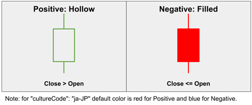
Also, for more granular candle color control see style.indicator.price.lineColorUp, style.indicator.price.lineColorDown and style.indicator.price.lineColorNeutral
Accepted Inputs:
- "openClose"
Default: NULL
Example
"style.indicator.price.markerType.candlestickFillRule": "openClose"
style.indicator.price.markerType.options
array: optional
Description: An array of user-selectable marker styles for the price chart.
Accepted Inputs:
All elements of the array must be a subset of the options listed in style.indicator.price.markerType, and the style specified by that property must be included in the list.
Default: NULL
Example
"style.indicator.price.markerType.options": ["line","candlestick","ohlc"]
style.indicator.proc.lineColor
string: optional
Description: Style option for Price Rate of Change indicator.
Default: "#4B7BBB"
Example
"style.indicator.proc.lineColor": "#04bbd3"
style.indicator.proc.lineWidth
number: optional
Description: Style option for Price Rate of Change indicator.
Default: 2
Example
"style.indicator.proc.lineWidth": 4
style.indicator.rsi.lineColor
string: optional
Description: Style option for Relative Strength Index (RSI) indicator.
Default: "#192F41"
Example
"style.indicator.rsi.lineColor": "#04bbd3"
style.indicator.rsi.lineWidth
number: optional
Description: Style option for Relative Strength Index (RSI) indicator.
Default: 2
Example
"style.indicator.rsi.lineWidth": 4
style.indicator.faststochastics.lineColor
string: optional
Description: Style option for Fast Stochastics indicator.
Default: "#192F41"
Example
"style.indicator.faststochastics.lineColor": "#04bbd3"
style.indicator.faststochastics.lineColorD
string: optional
Description: Style option for Fast Stochastics indicator.
Default: "#04BBD3"
Example
"style.indicator.faststochastics.lineColorD": "#04bbd3"
style.indicator.faststochastics.lineWidth
number: optional
Description: Style option for Fast Stochastics indicator.
Default: 2
Example
"style.indicator.faststochastics.lineWidth": 4
style.indicator.slowstochastics.lineColor
string: optional
Description: Style option for Slow Stochastics indicator.
Default: "#192F41"
Example
"style.indicator.slowstochastics.lineColor": "#04bbd3"
style.indicator.slowstochastics.lineColorD
string: optional
Description: Style option for Slow Stochastics indicator.
Default: "#04BBD3"
Example
"style.indicator.slowstochastics.lineColorD": "#04bbd3"
style.indicator.slowstochastics.lineWidth
number: optional
Description: Style option for Slow Stochastics indicator.
Default: 2
Example
"style.indicator.slowstochastics.lineWidth": 4
style.indicator.sma.lineWidth
number: optional
Description: Style option for Simple Moving Average indicator.
Default: 1
Example
"style.indicator.sma.lineWidth": 2
style.indicator.tsf.lineWidth
number: optional
Description: Style option for Time Series Forecast indicator.
Default: 1
Example
"style.indicator.tsf.lineWidth": 2
style.indicator.ultimateoscillator.lineColor
string: optional
Description: Style option for Ultimate Oscillator indicator.
Default: "#192F41"
Example
"style.indicator.ultimateoscillator.lineColor": "#04bbd3"
style.indicator.ultimateoscillator.lineWidth
number: optional
Description: Style option for Ultimate Oscillator indicator.
Default: 2
Example
"style.indicator.ultimateoscillator.lineWidth": 4
style.indicator.volume.fillColorDown
string: optional
Description: Color of the down volume marker.
Default: "#fd0000"
Examples
"style.indicator.volume.fillColorDown": "red"
or
"style.indicator.volume.fillColorDown": "#ff0000"
or
"style.indicator.volume.fillColorDown": "rgba(255, 0, 0, 0.5)"
style.indicator.volume.fillColorNeutral
string: optional
Description: Color of the neutral volume marker.
Default: "#999999"
Examples
"style.indicator.volume.fillColorNeutral": "gray"
or
"style.indicator.volume.fillColorNeutral": "#808080"
or
"style.indicator.volume.fillColorNeutral": "rgba(128, 128, 128, 0.8)"
style.indicator.volume.fillColorUp
string: optional
Description: Color of the up volume marker.
Default: "#00c02f"
Examples
"style.indicator.volume.fillColorUp": "green"
or
"style.indicator.volume.fillColorUp": "#008000"
or
"style.indicator.volume.fillColorUp": "rgba(0, 128, 0, 0.8)"
style.indicator.volumebyprice.upColor
string: optional
Description: Style option for Volume by Price indicator.
Default: "rgba(0,192,47,0.6)"
Example
"style.indicator.volumebyprice.upColor": "#04bbd3"
style.indicator.volumebyprice.downColor
string: optional
Description: Style option for Volume by Price indicator.
Default: "rgba(253,0,0,0.6)"
Example
"style.indicator.volumebyprice.downColor": "#04bbd3"
style.indicator.vroc.lineColor
string: optional
Description: Style option for Volume Rate of Change (VROC) indicator.
Default: "#F98254"
Example
"style.indicator.vroc.lineColor": "#04bbd3"
style.indicator.vroc.lineColorZero
string: optional
Description: Style option for Volume Rate of Change (VROC) indicator.
Default: "#FCD32E"
Example
"style.indicator.vroc.lineColorZero": "#04bbd3"
style.indicator.vroc.lineWidth
number: optional
Description: Style option for Volume Rate of Change (VROC) indicator.
Default: 2
Example
"style.indicator.vroc.lineWidth": 4
style.indicator.williamspctr.lineColor
string: optional
Description: Style option for Williams %R indicator.
Default: "#192F41"
Example
"style.indicator.williamspctr.lineColor": "#04bbd3"
style.indicator.williamspctr.lineWidth
number: optional
Description: Style option for Williams %R indicator.
Default: 2
Example
"style.indicator.williamspctr.lineWidth": 4
style.indicator.wma.lineWidth
number: optional
Description: Style option for Weighted Moving Average indicator.
Default: 1
Example
"style.indicator.wma.lineWidth": 2
style.palette
array: optional
Description: An array of colors used for the chart color palettes across the chart (including comparisons, upper/lower indicators). If fewer than 14 colors are supplied default colors will be used until there are a total of 14 colors in the palette. Also see style.indicator.price.lineColor for how to customize the line color on chart load.
Default Light Theme: ["#2496F1", "#F98254", "#009487", "#9D9D9D", "#E220A8", "#192F41", "#FD0000", "#DD4BF9", "#76C147", "#AD81C7", "#04BBD3", "#FCD32E", "#4B7BBB", "#00C02F"]
Default Dark Theme: ["#2496F1", "#F98254", "#009487", "#9D9D9D", "#E220A8", "#FFFFFF", "#FD0000", "#DD4BF9", "#76C147", "#AD81C7", "#04BBD3", "#FCD32E", "#4B7BBB", "#00C02F"]
Example
"style.palette": ["#FF6037", "#FF9966", "#FF9933", "#FFCC33", "#FFFF66", "#CCFF00", "#66FF66", "#AAF0D1", "#50BFE6", "#FF6EFF", "#EE34D2", "#FF00CC"]
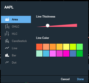
style.xAxis.tickColor
string: optional
Description: Style option for the tick mark color on the X-Axis
Default: "#CCCCCC"
Example:
"style.xAxis.tickColor": "#000000"style.xAxis.altTickColor
string: optional
Description: Style option for the alternate tick mark color on the X-Axis, which is used for major time divisions (For example, between years on a three-year timeframe)
Default: "#AAAAAA"
Example:
"style.xAxis.altTickColor": "#000000"symbol
string: required
Description: The financial symbol for the chart to graph. See Symbology.
Example
"symbol": "AAPL"
target
string: required
Description: The HTML element where the chart will be loaded. Note: If the target element is within a shadowRoot, see shadowTarget.
Example
"target": "#yourTarget"
template.size
string: optional
Description: Used to override the default template size used for the chart. By default, on chart load, Chartworks will measure the space allotted to it and determine if the small or large version of the chart should be shown (see Chart Breakpoints). However, if you wish to override this behavior you can instead pass in "template.size": "large" or "template.size": "small" to force the chart to display either the small or large template size.
Accepted Inputs
- "small"
- "large"
Default: Dynamically selected (see Chart Breakpoints)
Example
"template.size": "large"
theme
string: optional
Description: Color theme for the chart.
Accepted Inputs:
- "light" for the light theme
- "dark" for the dark theme
Default: "light"
Example
"theme": "dark"
timeframe
string: optional
Description: The timeframe the chart is set to on load. You can customize what timeframes are displayed with feature.large.timeframes and feature.small.timeframes. Also see interval and period if you wish to have more granular control over the default frequency the chart loads with.
Accepted Inputs
- "1d" for 1 Day
- "5d" for 5 Days
- "1m" for 1 Month
- "3m" for 3 Months
- "6m" for 6 Months
- "ytd" for Year To Date
- "1y" for 1 Year
- "3y" for 3 Years
- "5y" for 5 Years
- "10y" for 10 Years
Default: "1y"
Example
"timeframe": "1y"
token
string: required
Description: Authentication token. See Authentication for more details on how to obtain a token.
Example
"token": "9CwutfDn1xriBoLOtBQ5HcDPIjbq"
typeAheadAPI
string: optional
Description: Type ahead search API. Search parameter is in the URL as %s. See Type Ahead API for details on what the API should return.
Default: NULL
Examples
"typeAheadAPI": "https://yourTypeAheadApi.com?searchTerm=%s"
or
"typeAheadAPI": "https://yourTypeAheadApi.com/searchTerm/%s"
xid
string: optional
Description: In some cases clients may have access to Communify's in-house symbol set named 'xid'. If you have access and wish to pass in 'xid' as your symbol set you can simply pass in xid in the config. If xid is passed in the symbol and exchange config params will be ignored. If using xid you should pass in displaySymbol (optionally can pass displayExchange as well).
Default: NULL
Example
"xid": "36276"
Events
onAPIError
Called any time the APIs encounter a non-200 API response (only applies to Communify APIs). Primary use is to signal when a passed token has expired or was not accepted. This will result in a status 401 and should be handled by the client by generating a new token and passing the new token into the config (see setConfigParam).
Example 401 Handling
Note that we initially pass in an invalid token ("BAD-TOKEN") into the chart config which will result in an 401 unauthorized error. We then generate a new token and reload the data.
new ChartworksBuilder({
    "token": "BAD-TOKEN",
    "target": "#chartTarget",
    "symbol": "AAPL",
    "exchange": "NSQ",
    "onAPIError": function(apiError) {
        // handle 401 (unauthorized)
        if (apiError.status === 401) {

            // show dialog that we are getting a new token
            this.showDialog("Token expired", "Loading new token...");

            // use getInvalidTokenCount to ensure we don't get stuck in an
            // endless loop if we keep creating bad tokens
            if (this.getInvalidTokenCount() < 5) {
                var objChart = this;
                getNewToken(function(newToken) {
                    // set token
                    objChart.setConfigParam('token', newToken);

                    // load data
                    objChart.loadData();
                });
            } else { // fail after 5 unsuccessful tries
                this.showDialog("Warning", "Max number of auth attempts reached. Your token generation is no good!");
            }
        } else { // print other errors in the console
            console.log(apiError.status, apiError.statusMsg);
        }
    }
});

// Your code should generate a new token.
// This is just an example.
function getNewToken(onComplete) {
    // timeout to simulate slow token generation
    setTimeout(function() {
        // create a good token
        var token = "demo-token";
        onComplete(token);
    }, 1000);
}
onChartLoad
Called each time chart data API completes.
Example
new ChartworksBuilder({
    "token": "demo-token",
    "target": "#chartTarget",
    "symbol": "AAPL",
    "exchange": "NSQ",
    "onChartLoad": function() {
        console.log("api done loading");
    }
});
onPrimarySymbolChange
Called any time the primary chart symbol is changed. Implemented as an input in the chart config. Returns the symbol and exchange.
Example
new ChartworksBuilder({
    "token": "demo-token",
    "target": "#chartTarget",
    "symbol": "AAPL",
    "exchange": "NSQ",
    "onPrimarySymbolChange": function(args) {
        console.log(args.symbol);
        console.log(args.exchangeId);
    }
});
onShare
Called any time the 'Share' button is clicked in the top menu (see feature.share). Within the onShare event you will get passed a unique chartID that is generated for the chart you are viewing. It is up to the developer implementing the charts to determine how to handle this chartID. In the code example below we have setup a simple page that when called with a chartID appended to the end will take that chartID and pass it into the chartID chart config parameter and load the chart.
https://www.chartworks.io/Public/charts/loadchart/{your_chartID_here}
We have also created two useful CodePen examples. Our Full Example includes a share option which generates a URL pointing to a second CodePen example that then loads the shared chart. These examples together show one possible end to end way to share a chart then load the shared chart.
Example
new ChartworksBuilder({
    "token": "demo-token",
    "target": "#chartTarget",
    "symbol": "MSFT",
    "exchange": "NSQ",
    "feature.share": true,
    "onShare": function(args) {
        var shareURL = "https://www.chartworks.io/Public/charts/loadchart/" + args.chartID;
        this.showDialog("<a href=" + shareURL + " target=\"_blank\">View Your Shared Chart</a>");
    }
});
Methods
addIndicator
addIndicator(id, params);
When called adds the passed upper or lower indicator to the chart.
id
string: required
Description: The id of the indicator to be added to the chart.
Accepted Inputs:
Any one of the ID strings in the Indicators list.
Default: NULL
params
obj: optional
Description: Object with the indicator settings. If not passed the default params for the indicatro will be used.
Accepted Inputs:
Not all indicators have settable parameters. For those that do, and when otehr than default settings are required, pass one of the JSON parameter strings in the Indicators list.
Default: NULL
Examples
addIndicator("macd");
or
addIndicator("macd", {"fastperiod":14,"slowperiod":28,"smoothing":8});
addIndicators
addIndicators(array of objects);
Just like addIndicator() but with the ability to add multiple uppers/lowers at once with or without params for each indicator. See Indicators for the list of accepted id inputs and params inputs.
Examples
addIndicators([
    {
        "id": "bollinger"
    },{
        "id": "slowstochastics"
    }
]);
or
addIndicators([
    {
        "id": "bollinger",
        "params": {"period":20,"standardDeviations":2}
    },{
        "id": "slowstochastics",
        "params": {"kperiod":14,"smoothing":3,"dperiod":3}
    }
]);
clearCustomEvents
clearCustomEvents();
When called will remove all custom events (see customEvents and loadCustomEvents) from the chart. Anytime the primary symbol changes all custom events are also removed from the chart. See loadCustomEvents for a full custom events example.
destroy
var mychart = new ChartworksBuilder({...});

mychart.destroy();

mychart = null;
When called the destroy method forcibly removes large object structures in memory that are used by the chart during its operation. Reduces memory leaks on long-running single-page applications that are repeatedly spinning up and tearing down new chartworks objects.
downloadImage
downloadImage();
When called initiates the download of the chart image to client.
generateChartID
generateChartID(callback);
When called returns a unique chartID that is generated for the chart you are viewing (the ID generated mimics the onShare event). The ID can be passed into chartID to load the chart. One use case for generateChartID() is to copy a user's chart and then load it for them in an alternative view. For example, opening the existing chart in a pop-up window.
Example
generateChartID(function(args){
    console.log(args.chartID);
});
getCurrentExchange
getCurrentExchange();
When called returns the current exchange as a string (e.g. "NSQ").
getCurrentSymbol
getCurrentSymbol();
When called returns the current symbol as a string (e.g. "AAPL").
getCurrentTimeframe
getCurrentTimeframe();
When called returns the current timeframe as a string (e.g. "1y"). This method does not take into account panning or zooming. For example, if the user selects a "1 Year" timeframe and then zooms out, when getCurrentTimeframe(); is called it will return 1y.
getExportData
getExportData();
This will output a data structure similar to:
{
    "series":[
        {"date":"2017-10-18","open":-0.031158,"high":0.149561,"low":-0.542157,"close":-0.44245},
        {"date":"2017-10-19","open":-2.31819,"high":-2.112544,"low":-3.396273,"close":-2.798031},
        {"date":"2017-10-20","open":-2.405434,"high":-1.695021,"low":-2.810494,"close":-2.629775}
    ],
    "columns":["date","open","high","low","close"]
}
If looking at an intraday chart, the date will include a time portion. Date format is in exchange local time. A UTC offset is also returned for the current exchange:
{
    "series":[
        {"date":"2018-10-18T09:33:00","open":-1.505493,"high":-1.062435,"low":-1.577829,"close":-1.424115},
        {"date":"2018-10-18T09:36:00","open":-1.442199,"high":-1.31109,"low":-1.572946,"close":-1.478367},
        {"date":"2018-10-18T09:39:00","open":-1.460283,"high":-1.162078,"low":-1.478367,"close":-1.207107}
    ],
    "columns":["date","open","high","low","close"],
    "utcOffset":-240
}
This structure can be converted to HTML in any way convenient for the implementing developer.
getExportPanels
getExportPanels();
When called returns all of the upper and lower chart parameters currently on the chart.
getInvalidTokenCount
getInvalidTokenCount();
When called returns the current count of API calls that had 401 status response. Each 401 request increments the counter by 1, any API success 200 code resets the counter to 0. The primary usage is for handling generating a new token and avoiding an endless loop of submitting bad tokens. See onAPIError for a code example.
loadCustomEvents
loadCustomEvents(JSON_array);
Used to add custom events to the chart. loadCustomEvents accepts a JSON array for custom chart events. JSON details are below. Also see customEvents and clearCustomEvents for additional ways to interact with custom events.
JSON Inputs for loadCustomEvents and customEvents
The below JSON inputs apply to both loadCustomEvents and customEvents:
label
string: optional
Description: The label for the custom events to be displayed in the Event menu.
Default: NULL
Example
"label": "Our Custom Events"
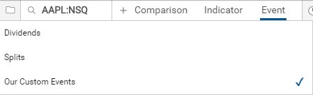
display
boolean: optional
Description: If true then the custom events are shown, if false the custom events are not shown but the label will still appear in the Event menu for the user to select.
Default: true
Example
"display": false
minHorizDistance
int: optional
Description: The minimum horizontal distance between two event icons before they stack on top of each other. The smaller the number to more two icons will overlap each other on the chart.
Default: 5
Example
"minHorizDistance": 10
minVertDistance
int: optional
Description: The vertical spacing between stacked event icons.
Default: 17
Example
"minVertDistance ": 20
dataset
JSON array: optional
Description: JSON array of all custom events. Details for all of the JSON parameters are below.
Default: NULL
Example
"dataset": [{
    "date": "2015-11-03",
    "iconCharacter": "X",
    "iconCharacterColor": "white",
    "iconBackgroundColor": "#2BA92B",
    "rolloverTitle": "MSFT Event 1",
    "rolloverBodyText": "Some awesome event 1 text here"
} , {
    "date": "2015-12-03",
    "iconCharacter": "X",
    "iconCharacterColor": "white",
    "iconBackgroundColor": "#2BA92B",
    "rolloverTitle": "MSFT Event 2",
    "rolloverBodyText": "Some awesome event 2 text here"
}]
JSON Inputs for dataset
date
string: required
Description: The date where the event will be displayed. The date string should be in a format recognized by Javascript's Date.parse() method (IETF-compliant RFC 2822 timestamps and also a version of ISO8601).
If the passed date is on a non-trading date (weekends/holidays) or during non-trading hours, the icon will appear on the nearest trading date. If the passed date is in the future, the icon will not be displayed.
If a time is included it will be parsed and applied as a local exchange time based the time zone of the primary symbol's exchange. For example if your primary symbol was BP trading on the LSE (London Stock Exchange) and your customEvent date was 2014-03-07T10:18:00 it would display on the chart @ 10:18am local London Stock Exchange time. If instead your primary symbol was AZN trading on the ASX (Australian Securities Exchange) and your customEvent date was 2014-03-07T10:18:00 it would display on the chart @ 10:18am local Sydney time.
Examples
"date": "March 7, 2014" // parsed as local exchange time
"date": "2014-03-07T10:18:00" // parsed as local exchange time
iconCharacter
string: optional
Description: The character contained within the icon. Icon only has space for a single character.
Default: NULL
Example
"iconCharacter": "X"
iconCharacterColor
string: optional
Description: The font color of the character contained within the icon.
Default: #FFFFFF
Example
"iconCharacterColor": "white"
iconBackgroundColor
string: optional
Description: The background color of the icon.
Default: #999999
Example
"iconBackgroundColor": "green"
rolloverTitle
string: optional
Description: The text of the rollover title.
Default: NULL
Example
"rolloverTitle": "Event Title"
rolloverBodyText
string: optional
Description: Text contained in the body of the rollover. If you wish to include HTML in the body see rolloverBodyHTML below. If both rolloverBodyText and rolloverBodyHTML are passed in the JSON with values then only rolloverBodyText will be displayed in the rollover.
Default: NULL
Example
"rolloverBodyText": "Just some text down here."
rolloverBodyHTML
string: optional
Description: HTML contained in the body of the rollover. If both rolloverBodyText and rolloverBodyHTML are passed in the JSON with values then only rolloverBodyText will be displayed in the rollover.
Default: NULL
Example
"rolloverBodyHTML": "Visit <a href=\"https://www.chartworks.io\" target=\"_blank\" style=\"color:yellow!important\">chartworks.io</a>"
datasetURL
string: optional
Description: Alternatively, instead of passing in a JSON array into dataset you can instead pass in an API URL that returns the JSON array event data. The main advantage here is that the API URL you supply in datasetURL won't be called until the user clicks on the UI element to add the event to the chart. Your API must return data in the same format outlined above in dataset.
Default: NULL
Example
"datasetURL": "./events/my_custom_events.json"
datasetCallback
function: optional
Description: In conjunction with datasetURL, if you need to do additional client-side processing of your JSON event data you can do so using datasetCallback.
Default: NULL
Example
"datasetURL": "./events/my_custom_events.json",
"datasetCallback": function(data){
    return data.map(function(row){
        row.iconImage = "img/location.png";
        return row;
    });
}
Full loadCustomEvents Example
The below is an example is contained within the onPrimarySymbolChange event:
"onPrimarySymbolChange": function(args) {
    // create events JSON for MSFT
    var info_events = [{
        "label": "Our Custom Events",
        "display": true,
        "minHorizDistance": 10,
        "minVertDistance": 20,
        "dataset": [{
            "date": "2015-11-03",
            "iconCharacter": "X",
            "iconCharacterColor": "white",
            "iconBackgroundColor": "#2BA92B",
            "rolloverTitle": "MSFT Event 1",
            "rolloverBodyText": "Some awesome event 1 text here"
        } , {
            "date": "2015-12-03",
            "iconCharacter": "X",
            "iconCharacterColor": "white",
            "iconBackgroundColor": "#2BA92B",
            "rolloverTitle": "MSFT Event 2",
            "rolloverBodyText": "Some awesome event 2 text here"
        }]
    }];

    // add MSFT events to chart if primary symbol is MSFT
    if (args.symbol == 'MSFT') {
        this.loadCustomEvents(info_events);
    }
}
See custom events for other examples.
loadData
loadData();
When called will reload the data based on the current view. For example, if the chart config has a timeframe of 1y and the user changes the timeframe to be 5 years in the UI, if loadData(); is called it will make a new data call for the 5 years of data not changing the user's timeframe.
By default loadData(); will show the loading spinner once called. If you wish to suppress the loading icon from showing you can pass in {silent: true}, so the call would be loadData({silent: true});
Example
new ChartworksBuilder({
    "token": "demo-token",
    "target": "#chartTarget",
    "symbol": "AAPL",
    "exchange": "NSQ",
    "onAPIError": function(apiError) {
        console.log(apiError.status, apiError.statusMsg);

        // handle 401 (unauthorized) error by getting a new token
        if (apiError.status === 401) {
            // your code to generate a new token should go here
            var newToken = "my-new-token";

            // update the config token
            this.setConfigParam("token", newToken);

            // gracefully reload the chart data
            this.loadData();
        }
    }
});
print();
When called initiates the print of the chart.
reload
reload();
When called will reload the entire chart based on the chart config parameters. For example, if the chart config has a timeframe of 1y and the user changes the timeframe to be 5 years in the UI, if reload(); is called it will pull in the parameters from the config and completely reload the chart so that the timeframe shown will be 1 year instead of 5 years.
Example
new ChartworksBuilder({
    "token": "demo-token",
    "target": "#chartTarget",
    "symbol": "AAPL",
    "exchange": "NSQ",
    "typeAheadAPI": "https://api.wallst.com/apiman-gateway/MOD/chartworks-xref/1.0/xref/predictive?search=%s",
    "onPrimarySymbolChange": function() {
        // add a lower indicator
        this.setConfigParam("panel.lower.indicator", "MACD");

        // reload chart
        this.reload();
    }
});
removeIndicatorsById
removeIndicatorsById(id);
Used to remove an upper/lower indicator from the chart.
id
string or comma-separated strings: required
Description: The id(s) of the upper or lower indicator to be removed from the chart.
Accepted Inputs:
One or more of the ID strings in the Indicators list.
Default: NULL
Example
removeIndicatorsById("volume");
or
removeIndicatorsById("sma","bollinger","macd");
removeIndicatorsByPanelType
removeIndicatorsByPanelType(panelType);
Used to remove all upper or lower indicators from the chart.
panelType
string: required
Description: The chart panel (upper or lower) to remove all indicators from.
Accepted Inputs:
- "upper" for all upper indicators
- "lower" for all lower indicators
Default: NULL
Example
removeIndicatorsByPanelType("upper");
or
removeIndicatorsByPanelType("lower");
reset
var largeChart = new ChartworksBuilder({
    "token": "demo-token",
    "target": "#chartTarget",
    "symbol": "AAPL",
    "exchange": "NSQ",
    "persistentSettings": "session",
    "id": "large_chart"
});

// later to reset chart call
largeChart.reset();
When called will reset the chart back to its original config. Also see feature.settings.reset for the UI version in the settings menu. Can be useful especially when using persistentSettings.
resize
resize();
When called re-draws the chart based on the new dimensions.
setConfigParam
setConfigParam(configParamName, configParamValue);
Used to update chart config parameters. Used in conjunction with the reload and loadData methods.
Example
This example shows how to handle regenerating a new auth token.
new ChartworksBuilder({
    "token": "demo-token",
    "target": "#chartTarget",
    "symbol": "AAPL",
    "exchange": "NSQ",
    "onAPIError": function(apiError) {
        console.log(apiError.status, apiError.statusMsg);

        // handle 401 (unauthorized) error by getting a new token
        if (apiError.status === 401) {
            // your code to generate a new token should go here
            var newToken = "my-new-token";

            // update the config token
            this.setConfigParam("token", newToken);

            // gracefully reload the chart data
            this.loadData();
        }
    }
});
setCurrentSymbol
setCurrentSymbol(JSON_array);
Used to change the chart's primary symbol.
JSON Inputs for setCurrentSymbol
symbol
string: required
Description: The symbol of the security. See Symbology for more details.
Default: NULL
Example
"symbol": "AAPL"
exchange
string: optional/required
Description: The exchange code for the symbol. This input is required if you are utilizing the Exchange Symbol + Exchange Code as your symbol set; otherwise it is optional. See Symbology for more details.
Default: NULL
Example
"exchange": "NSQ"
setCurrentSymbol Example
setCurrentSymbol({
    "symbol": "AAPL",
    "exchange": "NSQ"
});
setFrequency
setFrequency(interval, period);
interval
int: required
Description: The interval of the frequency. For interday charts anything but 1 is ignored.
Accepted Inputs:
- 1
- 3
- 5
- 15
Default: NULL
period
string: required
Description: The period of the frequency.
Accepted Inputs:
- "Minute"
- "Hour"
- "Day"
- "Week"
- "Month"
Default: NULL
Example
setFrequency(1, "Day");
setTimeframe
setTimeframe(timeframe);
timeframe
string: required
Description: The timeframe to show on the chart.
Accepted Inputs:
- "1d" for 1 Day
- "5d" for 5 Days
- "1m" for 1 Month
- "3m" for 3 Months
- "6m" for 6 Months
- "ytd" for Year To Date
- "1y" for 1 Year
- "3y" for 3 Years
- "5y" for 5 Years
- "10y" for 10 Years
- "15y" for 15 Years
- "20y" for 20 Years
- "max" for all data
Default: NULL
Example
setTimeframe("5y");
showDialog
showDialog(modalTitle, modalHtml);
Used to display a modal over the chart. Method accepts two inputs; one for the title and one for the body HTML, both strings.
Example
The below is an example is contained within the onPrimarySymbolChange event:
onPrimarySymbolChange: function() {
    this.showDialog("Alert", "The primary symbol has changed.");
}
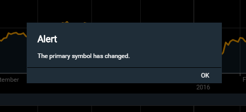
startPoll
startPoll(seconds);
When called will start polling for new charting data on the set number of seconds (int) passed into startPoll(). Default polling frequency is 60 seconds; minimum allowed polling frequency is 10 seconds. Also see poll.rate and stopPoll.
Example
startPoll(30);
stopPoll
stopPoll();
When called will stop polling for new charting data. Also see poll.rate and startPoll.
Example
stopPoll();
toDataURI
toDataURI();
When called returns a base64 image string of the current chart; example: "data:image/png;base64,iVBORw0KGgoAAAANSUhEUgAAA..."
toggleEvent
toggleEvent(eventId, state);
eventId
string: required
Description: The eventID you want to show/hide on the chart
Accepted Inputs:
- "dividends" for dividend events
- "splits" for split events
- "custom" for custom events (see customEvents)
Default: NULL
state
boolean: optional
Description: Can be used to force on (true) or off (false) an event from showing. If omitted, the event will be auto-toggled to its opposite state.
Default: auto-toggled to its opposite state
Example
toggleEvent("dividends");
Chartworks JS, Versioning and Security
JavaScript
To render the HTML5 chart you need to include the Chartworks JS file. You can see this in the Minimum Example as:
<!-- Chartworks JS -->
<script src="https://www.chartworks.io/content/chartworks/dist/1.4.11/js/chartworks.min.js"></script>
The different Chartworks JS file versions are available on our CDN by modifying the version number in the URL. For version 1.1.0 you'd use:
https://www.chartworks.io/content/chartworks/dist/1.1.0/js/chartworks.min.js
For version 1.2.0 you'd use:
https://www.chartworks.io/content/chartworks/dist/1.2.0/js/chartworks.min.js
Versioning
The HTML5 charts support Major, Minor and Patch releases following the Semantic Versioning methodology. Once a release has been made (say v1.1.0) Chartworks will not update that release with altered code (for example a bug fix). If a bug is found in v1.1.0, a Patch release will be created (v1.1.1) and deployed for clients to consume. The client side code will sit under a versioned URL path (i.e. /1.1.0/) with /js, /css etc directories under the version.
Subresource Integrity (SRI)
As a measure to increase the security of including Chartworks in client sites, it supports Subresource Integrity (SRI) as of v1.4.10. This broadly-supported web standard helps Chartworks clients know that included scripts have not changed in any way since being implemented and tested; modern browsers will create a "hash" of the downloaded script and compare it to the hash provided in the tag, only evaluating the content if they both match. To enable this at the top level, use the following snytax for the script tag (substituting the hash provided for the version you are using):
<!-- Chartworks JS -->
<script src="https://www.chartworks.io/content/chartworks/dist/1.4.11/js/chartworks.min.js" integrity="sha512-eqZ4atSk/Zzlts97uUe8KIRmOYsaIod/60CJvd0ev4mM1cJzl7ZsJsXZZibOXTSZK4XbgWTj3eSp9GKyDOQH6w==" crossorigin="anonymous"></script>
HTML5 Change Log
v1.4.28
Released Oct 2025
Features and Fixes
- Added apiAuthMode input
JavaScript Location:
https://www.chartworks.io/content/chartworks/dist/1.4.28/js/chartworks.min.jsv1.4.27
Released Sep 2025
Features and Fixes
- Fixed a timezone issue on the Load Template popup
- Added hover text to the Save/Load icon
JavaScript Location:
https://www.chartworks.io/content/chartworks/dist/1.4.27/js/chartworks.min.js v1.4.25
Released June 2024
Features and Fixes
- Added currency and showMajorCurrency inputs
JavaScript Location:
https://www.chartworks.io/content/chartworks/dist/1.4.25/js/chartworks.min.jsv1.4.23
Released June 2023
Features and Fixes
- Improved destroy() method
JavaScript Location:
https://www.chartworks.io/content/chartworks/dist/1.4.23/js/chartworks.min.js
v1.4.23
Released March 2023
Features and Fixes
- Improved Web Component compatibililty
JavaScript Location:
https://www.chartworks.io/content/chartworks/dist/1.4.23/js/chartworks.min.js
v1.4.22
Released January 2023
Features and Fixes
- Added support for embedding Chartworks into a Web Component
JavaScript Location:
https://www.chartworks.io/content/chartworks/dist/1.4.22/js/chartworks.min.js
v1.4.21
Released February 2021
Features and Fixes
- Switches to aria-current attribute for selected small template time span button
JavaScript Location:
https://www.chartworks.io/content/chartworks/dist/1.4.21/js/chartworks.min.js
v1.4.20
Released August 2021
Features and Fixes
- Add params to enable/disable CDN prefix for loading dependencies
- Fix area chart type display in dropdown
JavaScript Location:
https://www.chartworks.io/content/chartworks/dist/1.4.20/js/chartworks.min.js
v1.4.19
Released May 2021
Features and Fixes
- Fix small template button click events
JavaScript Location:
https://www.chartworks.io/content/chartworks/dist/1.4.19/js/chartworks.min.js
v1.4.18
Released April 2021
Features and Fixes
- Fix event icon display issue
- Add support for custom locales
- Chrome mousewheel zoom bug fix
- General bug fixes
JavaScript Location:
https://www.chartworks.io/content/chartworks/dist/1.4.18/js/chartworks.min.js
v1.4.17
Released March 2021
Features and Fixes
- Updated translations for IT locale
- Style customizaton for Previous Close indicator
- General bug fixes
JavaScript Location:
https://www.chartworks.io/content/chartworks/dist/1.4.17/js/chartworks.min.js
v1.4.16
Released Dec 2020
Features and Fixes
- Allow customization of grid dash styles
- General bug fixes
JavaScript Location:
https://www.chartworks.io/content/chartworks/dist/1.4.16/js/chartworks.min.js
v1.4.15
Released Oct 2020
Features and Fixes
- Enabled ADA table for chartworks.io demo
- Made a series of chart styles configurable
- Updated translations for IT locale
- General bug fixes
JavaScript Location:
https://www.chartworks.io/content/chartworks/dist/1.4.15/js/chartworks.min.js
v1.4.14
Released Feb 2020
Features and Fixes
- General bug fixes
JavaScript Location:
https://www.chartworks.io/content/chartworks/dist/1.4.14/js/chartworks.min.js
v1.4.13
Released Jan 2020
Features and Fixes
- Accessibility Updates
- General bug fixes
JavaScript Location:
https://www.chartworks.io/content/chartworks/dist/1.4.13/js/chartworks.min.js
v1.4.12
Released Nov 2019
Features and Fixes
- Added the Previous Close upper indicator
- General bug fixes
JavaScript Location:
https://www.chartworks.io/content/chartworks/dist/1.4.12/js/chartworks.min.js
v1.4.11
Released July 2019
What's new in v1.4.10:
Features and Fixes
- Chartworks HTML5 now supports a user option to mark a new template as "Default". That template is stored in the cloud, and when new charts are loaded it will automatically be applied. Developers can set the new feature.saveLoadDefaultTemplate flag to enable this feature.
- General bug fixes
JavaScript Location:
https://www.chartworks.io/content/chartworks/dist/1.4.11/js/chartworks.min.js
v1.4.10
Released June 2019
What's new in v1.4.10:
Impactful Changes
-
We have added new Extended Fibonacci and Measure Trendline tools. As a result the full set of all available tools does not always fit for some small chart windows, so the default set of feature.tools has been changed. A new feature.tools.options parameter supports custom tool sets; to return to the previous default set, add the following to a chart configuration:
"feature.tools.options": ["crosshair", "text", "line", "horizontal", "ray", "extended", "arrow", "ellipse", "rect", "fibonacci", "fibarc", "fibcircle", "gannfan"] -
Style support for the 'stochastics' indicators has been split into styles specific to the fast and slow versions. Any implementations using the following properties will need to update them to continue seeing their custom styles:
- style.indicator.stochastics.lineColor
- style.indicator.stochastics.lineColorD
-
style.indicator.stochastics.lineWidth
The new versions of these properties are:
- style.indicator.faststochastics.lineColor
- style.indicator.faststochastics.lineColorD
- style.indicator.faststochastics.lineWidth
- style.indicator.slowstochastics.lineColor
- style.indicator.slowstochastics.lineColorD
- style.indicator.slowstochastics.lineWidth
Features and Fixes
- Chartworks HTML5 now supports Subresource Integrity (SRI) for better client-side security, so script paths like the above now include the corresponding SHA hashes. Developers can use the new dependencySRI flag to also enable SRI for all resources included by Chartworks. For more on SRI, see Chartworks JS, Versioning and Security.
- For fewer fourth-party resources calls, the top-level script now embeds its fonts.
- Fill 'area' markers with a gradient rather than a flat color, using the new style.indicator.price.fillGradient flag.
- New Canadian English language support, along with improvements to the Canadian French and Japanese localizations.
- Added the ability to specify a subset of the available marker types for user selection, using the new style.indicator.price.markerType.options property.
- Limit the number of upper and lower indicators a user can add to a chart using the new properties feature.indicators.upperLimit and feature.indicators.lowerLimit.
- The new getExportData() method provides access to data series for custom functionality or accessibility purposes.
- New support for customizing how indicators are selected using a dropdown menu option (feature.indicators.menuType).
- Added support for customizing the list of available indicators (feature.indicators.options) and the default parameters for most indicators (feature.indicators.params).
- Improved menu dropdowns, dialogs and save-template interactions in narrow windows.
- Improved responsive display of header data points; as the window width decreases, Chartworks will first drop the high and low data points, then the open.
- The new country property now supports clients who provide a country context along with a symbol for lookups.
- General bug fixes
JavaScript Location:
https://www.chartworks.io/content/chartworks/dist/1.4.10/js/chartworks.min.js
SRI Hash:
sha512-vrIfLbtitudBdiWSQGF/H/XOGJd8gVA/JzgFraSoGPweyiNar2NP6+rpA0tdfIC0JCgtCqV2d6ZD1gMjQyiWnA==
v1.4.8
Released September 2018
What's new in v1.4.8:
- New feature.large.timeframes config param that gives you the ability to customize what timeframes are shown in the large chart menu.
- New config params interval and period that can be used in conjunction with timeframe to load the chart to a set timeframe and frequency.
- Added new intraday timeframe options '10 day' and '20 day' that can be used in feature.large.timeframes, feature.small.timeframes and timeframe.
- New Ichimoku Cloud upper indicator can be found under "Trend" in the Indicators menu.
- Added a new parameter style.indicator.price.markerType.candlestickFillRule to control the calculation used to display Candlesticks.
- New persistent chart settings so user chart settings stay the same when navigating from one page or security to another. See persistentSettings and id for details.
- To aid in resetting charts back to the original config we've also added a new option in the settings menu feature.settings.reset and a new method reset() which come in handy when using persistentSettings.
- New config param events that allow the chart to be loaded with dividends and/or splits events already showing.
- You can now hide individual non-custom events in the Event menu with feature.events.dividends and feature.events.splits.
- Added the ability to lazy load and process custom event data only when a user selects the event. See datasetURL and datasetCallback under the loadCustomEvents method. Note that datasetURL and datasetCallback can also be used in customEvents.
- The feature.legend.autoExpand config param has been updated to allow "all" to be passed in which will automatically expand the legend if either an upper indicator or comparison is added.
- Ability to show detailed rollover data for upper and lower indicators with showIndicatorLegendValues and feature.settings.indicatorLegendValues.
- New upper indicator y-axis value flags. See showIndicatorFlags and feature.settings.indicatorFlags.
- Web Accessibility of the chart have been improved with this release. Specifically focused on Keyboard Accessible and Navigable.
- New destroy method added. Especially useful on single page applications.
- The default value of feature.settings.extendedHours has been updated to
falsefromtruesince having access to extended hours data is not a given for clients. - Updated rollover values to appear on chart load instead of waiting for the user to interact with the chart. This was a minor change but makes a better presentation of the chart after load especially on mobile.
- All indicator styles are now documented. See style.indicator.adl.lineColor for the start of the list.
- General bug fixes
JavaScript Location:
https://www.chartworks.io/content/chartworks/dist/1.4.8/js/chartworks.min.js
v1.4.6
Released March 2018
What's new in v1.4.6:
- New timeframe option of 'Max' in the navigation which shows all the data for security currently being charted.
- New config param showAllMouseoverDecimalPoints that forces decimal places to always show in the rollover for large values.
- New panel.upper.indicator config param that allows you to load the chart with one or more upper indicators with or without parameters.
- Update to the panel.lower.indicator config param to optionally accept multiple indicators with or without parameters to be passed in.
- New optional inputs
minHorizDistanceandminVertDistanceadded to customEvents and loadCustomEvents() to allow more granular control over when event icons stack on top of each other and how much vertical space is between each icon when they do stack. - New getExportPanels() method that returns all of the upper and lower chart parameters currently on the chart.
- General bug fixes
JavaScript Location:
https://www.chartworks.io/content/chartworks/dist/1.4.6/js/chartworks.min.js
v1.4.5
Released February 2018
What's new in v1.4.5:
- New method to obtain a base64 URI of the current chart with toDataURI()
- Ability to set the default volume colors via style.indicator.volume.fillColorUp, style.indicator.volume.fillColorDown and style.indicator.volume.fillColorNeutral.
- New methods for removing indicators from the chart via removeIndicatorsByPanelType() and removeIndicatorsById()
- Updated the addIndicator() method to optionally accept indicator parameters.
- New addIndicators() method that allows you to add multiple upper/lower indicators with one call.
- General bug fixes
JavaScript Location:
https://www.chartworks.io/content/chartworks/dist/1.4.5/js/chartworks.min.js
v1.4.4
Released November 2017
What's new in v1.4.4:
- Ability to set the height of the lower indicator panel by percent of the overall chart area through panel.lower.size.percent.
- Chart performance has been improved by dropping the number of API requests needed to generate the chart.
JavaScript Location:
https://www.chartworks.io/content/chartworks/dist/1.4.4/js/chartworks.min.js
v1.4.3
Released November 2017
What's new in v1.4.3:
- Ability to set the default candle/OHLC/HLC colors via style.indicator.price.lineColorUp, style.indicator.price.lineColorDown and style.indicator.price.lineColorNeutral.
- Ability to set the value of the chart attribution via feature.attribution.value
- New feature to add custom icons to both standard events (Dividends/Splits) and to custom events. See feature.events.dividends.iconImage, feature.events.splits.iconImage and custom events for more details.
-
New methods added to make it easier for you to build custom chart UIs:
- addIndicator() add upper/lower indicators
- downloadImage() download chart image
- print() print chart
- resize() resize the chart
- setFrequency() change the chart frequency
- setTimeframe() change the chart timeframe
- toggleEvent() toggle chart events (like dividends, splits) on/off
- New feature.legend.autoExpand cofig param that can set the legend to default to be open on load.
- New feature.indicators.editColors cofig param which can suppress the color palettes in the indicator/symbol menus.
- New feature.legend.addOverlay cofig param which can suppress option to add indicators on lower indicators.
- Updated the split order (2:1 vs 1:2) shown in the event rollover to be 'from:to' for the ja-JP cultureCode. Other culture codes remain 'to:from'.
- General bug fixes
JavaScript Location:
https://www.chartworks.io/content/chartworks/dist/1.4.3/js/chartworks.min.js
v1.4.0
Released June 2017
What's new in v1.4.0:
- New Awesome Oscillator lower indicator.
- New Bollinger Band %B lower indicator.
- Added the ability to show comparison symbols on chart load with config parameter compareSymbols. Nice for Markets Overview pages where you'd like to show all the major indices on a single comparison chart without the user having to manually add them.
- Added the ability to supply the chart with a custom color palette with style.palette.
- Added the ability to easily chart currency cross rates by passing in the two currency codes you wish to chart. See Currency Cross Rates for details.
- New settings menu for toggling extended hours on/off, printing the chart and downloading the chart image. See feature.settings.
- Added the ability to display extended market hours data on intraday charts (currently only for US exchanges). See the Extended Hours section for more details.
- Added the ability to print the chart. See feature.settings.print for details.
- Added the ability to download the chart as an image. See feature.settings.downloadImage for details.
- Updated the Japanese ("ja-JP") culture code default up/down colors for Candlesticks, OHLC, HLC and lower indicators so that red is up and blue/green is down as Japanese users would expect.
- Updated some Japanese translations to be more accurate.
- Added better scroll wheel handling to prevent the page scrolling while zooming in/out the chart.
- Bug fix with tools not drawing on touch devices.
- General bug fixes
JavaScript Location:
https://www.chartworks.io/content/chartworks/dist/1.4.0/js/chartworks.min.js
v1.3.3
Released April 2017
What's new in v1.3.3:
- Added the ability to display Open, High and Low rollover data in addition to Close data on price styles that don't use Open, High, Low data to draw (e.g. Line, Area, Dot, Bar styles). See feature.dataLegendOHLC and feature.small.dataLegendOHLC for full details.
- Better error handling on API failures to suppress the loading spinner.
- General bug fixes
JavaScript Location:
https://www.chartworks.io/content/chartworks/dist/1.3.3/js/chartworks.min.js
v1.3.2
Released March 2017
What's new in v1.3.2:
- New polling support with config parameter poll.rate as well as startPoll and stopPoll methods
- New ability to customize small chart timeframe options with feature.small.timeframes
- General bug fixes
JavaScript Location:
https://www.chartworks.io/content/chartworks/dist/1.3.2/js/chartworks.min.js
v1.3.1
Released November 2016
What's new in v1.3.1:
- New displaySymbol config parameter
- New displayExchange config parameter
- The type ahead now accepts displaySymbol as an optional response field
- The type ahead now accepts displayExchange as an optional response field
- New template.size config parameter to select the chart template size (see chart breakpoints)
- New feature.small.comparison config parameter that displays the comparison menu on the small chart
- New feature.small.dataLegend config parameter that displays the rollover data legend on the small chart
- New cultureCode options for Japanese, Italian and French
- New feature.panZoom config parameter that enable/disables panning and zooming
- New optional
{silent: true}input for loadData() that suppresses the loading icon when calling loadData() - New xid config parameter to pass in the xid symbol set
- New feature.attribution.position config parameter to allow the attribution in different positions
- General bug fixes
JavaScript Location:
https://www.chartworks.io/content/chartworks/dist/1.3.1/js/chartworks.min.js
v1.2.0
Released September 2016
What's new in v1.2.0:
- New chart sharing functionality, see feature.share, onShare, chartID and generateChartID
- New style.indicator.price.markerType config parameter
- New Bollinger Band Width lower indicator
- New getCurrentSymbol method
- New getCurrentExchange method
- New setCurrentSymbol method
- New feature.attribution config parameter
- General bug fixes
JavaScript Location:
https://www.chartworks.io/content/chartworks/dist/1.2.0/js/chartworks.min.js
v1.1.0
Released July 2016
What's new in v1.1.0:
- New indicator shows high/low prices on chart (under 'Indicator' > 'Trend' > 'High / Low Price')
- New HLC (High Low Close) price style
- OHLC now supports up/down colors
- Improved collision handling for events displayed on the chart
- Timestamp added to intra-day rollovers
- New style.indicator.price.fillColor config parameter
- Ability for users to save a complete chart including symbol and drawings/annotations. See feature.saveLoad, feature.saveLoadCharts and feature.saveLoadTemplates for implementation options.
- Ability to show custom events in the Events menu to toggle on/off. See custom events and loadCustomEvents for more information.
- Exchange is now always displayed with symbols for clarification.
- General bug fixes
JavaScript Location:
https://www.chartworks.io/content/chartworks/dist/1.1.0/js/chartworks.min.js
v1.0.0
Released June 2016
This is the initial release of the Chartworks HTML5 charts.
JavaScript Location:
https://www.chartworks.io/content/chartworks/dist/1.0.0/js/chartworks.min.js